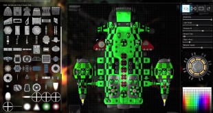
If you could have levied one complaint against the visual stylings of the original Gratuitous Space Battles, you could say that the colours weren't the most eye catching. There wer lots of greys and muted blues, which is fine if you're making Man of Steel, but not necessarily what you …
Read More » KitGuru KitGuru.net – Tech News | Hardware News | Hardware Reviews | IOS | Mobile | Gaming | Graphics Cards


