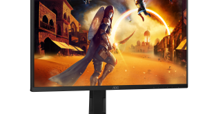
The Asus MS236H panel is exceptionally attractive and wouldn't look out of place on Steve Jobs office desk. The front bezel is finished in piano black with a pure white surround which is very sexy.
The rear of the screen is minimal in nature with a frosted ring which acts as the stand. Not only is it dramatically appealing to look at, but it is reasonably practical as it offers adjustable options via a 11 to 22 degree tilt.
While it looks in the image as if it would slide backwards there are two rubber feet under the fascia which offer stability. I wouldn't say it was as stable as a traditionally designed screen, but the appearance is totally eye catching and deserves a bonus point for trying to be different.
While this might not seem ideal as a ‘workhorse' computer monitor it scores higher if used in the context of a living room or kitchen environment. Several visitors to our offices showed a particular interest in the unit due to the striking design ethic.
The front of the screen has a small row of touch sensitive buttons which light blue when activated. While we have had positive experiences with this interface system on the Dell monitors we have reviewed, the Asus implementation seems to be slightly temperamental.
Above you can see the buttons, all activated as well as the highly reflective piano black surface, which gets dirty very quickly. Fingerprints and smudges covered our unit after even 10 minutes of adjusting settings. There are not many settings to play with apart from a range of picture modes which don't add anything to the image quality. Contrast, Brightness and Colour temperature controls are included, which really only need adjusted once. Thankfully.
Studying connectivity we can see that this is clearly more targeted to the living room audience that an enthusiast computer user. There is no support for DVI or Displayport, in fact the only digital option is HDMI. VGA is supported but we shudder to think that anyone is still using an analog input in 2010. Asus have incorporated an HDMI audio option via HDMI although there are no integrated speakers built into the unit.
Above you can see just how thin the panel is, without the ring stand. This is helped due to Asus moving the power input to an external unit which is a really positive move.
 KitGuru KitGuru.net – Tech News | Hardware News | Hardware Reviews | IOS | Mobile | Gaming | Graphics Cards


As I posted in the forums, I bought this screen on sale a while ago and agree. the image quality is ok, I actually think my old dell is better for IQ and its not a new LCD either 🙁
It looks beautiful, but its better switched off ! (well its not quite that bad, but I am disappointed and sorry I didnt go for the LED version).
that is very pretty. shame the panel isnt better. LED review coming? hope so !
Nice design, really hits the spot. shame about the lack of DVI in and the other issues mentioned. seems quite poorly thought out once they worked out the chassis design.
I saw one of these in a store. The higher end LED screen I think as it cost a lot more. I liked it. this one is clearly a bit more of a budget design.
oh dear, thats a pity, liked the look of it.
Wow, such an unbalanced product. all that time on design, moving out the power supply to an external unit to save on space. then they dont include a DVI port, or an adapter cable and mess up the interface buttons and slap in an average screen. Seems the money you spend goes to the designers. 🙁
@ Fluffychicken – heh, looks like Apple did make it :p
disappointing and probably good in a living room when people who dont really care that much about fine details. my parents would like this, but its too small for a TV or media center system.
Man, that sucks, I had looked at this model a while ago as an online store is discounting them right now. Looks like the higher end LED model might be the one to go for.
Not sure I even like the looks. that circular stand idea looks like a disaster waiting to happen and probably quite unstable. All the issues with the product make it hard to even put in a shortlist.
Hey guys, I wouldnt be getting too carried away with the LED MS238H version either, apparently there is a greenish hue with it. CNET reviewed it, looks quite bad.
http://reviews.cnet.com/lcd-monitors/asus-ms238h/4505-3174_7-33920330.html
@ Brad. thanks man, I agree it looks pretty crap after reading about it 🙁 seems looks are more important than quality for this range of screens. Hopefully they make new models with good panels in them.
Hey Zardon, I read on CNET they said this
“The stand keeps the monitor stabilized when knocked from the sides; however, when it encounters a force from the front–like a light breeze–it topples over.”
You never said the stand was unstable, is it bad or what?
Hi Stefan. The stand is fine, well I never experienced issues with it. I wouldn’t say it would withstand a hard knock without tilting over, but I dont think it would be an issue, unless you balanced it near the end of a desk and had a careless, clumsy friend.