First impressions and subjective testing
First impressions of the AG273QCG’s image quality are excellent, considering it’s a TN LCD display. Yes, viewing angles aren’t as good as some other LCD types but colours are punchy, colour balance is good and contrast is plentiful. This display clearly feels like a step up from cheaper TN gaming displays.
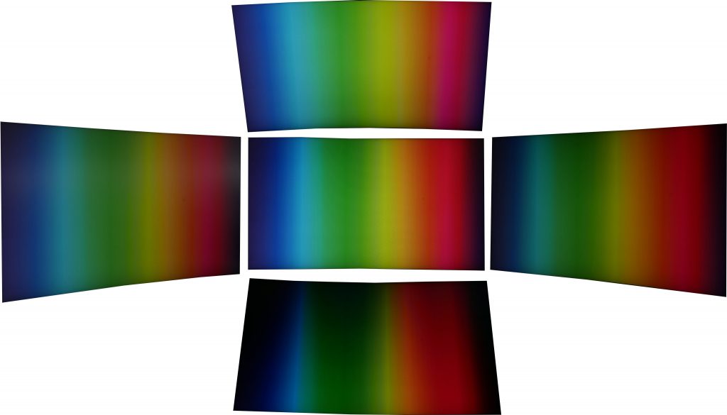
Except for one crucial thing: the whole screen looks grainy. We’re not exactly sure what’s causing this but it may be to do with the type of finish on the surface. It uses what looks and feels like a typical non-reflective matte finish but it may be just that bit rougher, leading to minute diffraction of the light.
The surface of the screen looks grainy
This is particularly noticeable on large blocks of uniform colour such as the white backgrounds that are common across many desktop apps. Navigating your computer's folders, reading emails in Outlook, browsing the web or writing this review in Word, those big blocks of white appear shimmering and multi-coloured, in a very subtle but distracting way.
As for those viewing angles, they’re actually far better than many TN displays we’ve seen. Moved left to right there’s minimal change in the image while tipped up and down and the image does change more but again it’s more stable than most. Crucially, that sense you get with some TN monitors where the slight natural movement of your head is enough to cause the image to constantly shift isn’t present.
Viewing angles aren't bad for a TN panel, with little discolouration off axis
Meanwhile, firing up a dark and subtlety shaded video like Game of Thrones and there’s none of the obvious telltale signs of some cheaper TN displays. The gamma curve looks correct so the image isn’t washed out or overly dark and nor is there the crushing of colours that can result in a blocky look.
As for the effect of the curved screen, it’s certainly subtle if at all beneficial but certainly it doesn’t detract from the experience. Generally we feel curved screens are more beneficial on larger displays such as 34inch ultrawide models.
Objective testing
Moving onto our objective testing, we used a couple of different colorimeters and measuring software to check the image output of the display.
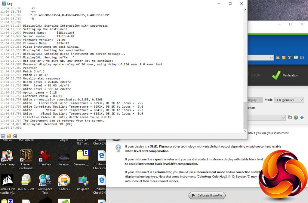
We start our testing with the Xrite iDisplay Pro, in conjunction with DisplayCal software. This we use to test the contrast of the display, as this is something our other test equipment tends to under report.
Our testing revealed the display can produce a contrast level of 833:1. This is a touch lower than some TN displays can manage but is within touching distance of the 1000:1 we’d expect. Anything less than 700:1 is where you really start to notice the image looking washed out.
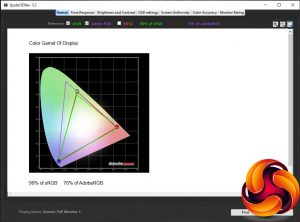
Moving onto our Spyder5Elite colorimeter and software, we next tested the colour space coverage, or gamut, of the display. For a display of this type we’d expect it to cover up to 100% of the sRGB gamut and around 75% of the AdobeRGB gamut, which is almost exactly the result we got.
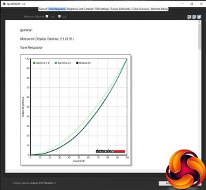
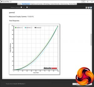
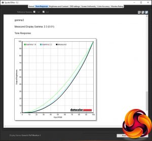
Next up is the tone response, or gamma test. This checks the gamma curve of the display, which is the measure of how quickly the image changes from light to dark. A higher value makes for a darker looking image while a lower value looks lighter. The standard for PCs is 2.2.
We can see from our test that the default gamma1 setting in the OSD is very close to the ideal of 2.2, so you shouldn’t need to change this. Meanwhile the gamma2 setting offers a lighter-looking 1.9 reading and the gamma3 provides a darker option, measuring 2.3.
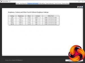
The next test measures how the display’s brightness setting ramps up in 25% increments. Ideally a display should offer a reasonably linear change so that it’s easy to dial in the brightness you want.
This is precisely what we find with this display, with its brightness steadily increasing as the brightness setting is turned up. Also note the underreported contrast figures.
The OSD settings test is for checking the effect that different colour modes have on the display. We can see from the below that the default Warm setting provides very close to the ideal colour temperature (white point) of 6500K so again most users shouldn’t need worry about changing this.
Meanwhile the Normal setting offers a slightly colder-looking image, and the Cool option is even bluer. Opt for the sRGB or User options and you get the same default colour balance as the Warm setting.
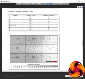
The penultimate test checks the uniformity of the display. Ideally a monitor should provide the same image performance across its whole screen, but that isn’t always the case. Here we can see that in terms of the brightness of the image, it’s not too bad but there’s a consistent drop of around 15% across nearly half the screen. However, on average the figure is an acceptable 9% and, moreover, in person the difference isn’t very noticeable.
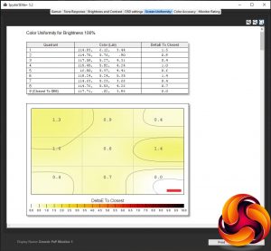
Colour uniformity is much better with just a 0.74 Delta E average variance in the image. However, it’s worth noting that the image will appear worse than this in many instances due to the viewing angle variation of the TN panel.
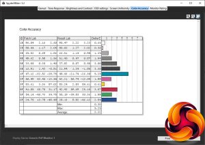
The final test measures the display’s ability to distinguish between fine differences in colour, a measure called Delta E. An average figure of below 3 is good and below 1 is excellent. This monitor manages 1.27, so it fares very well.
Calibration
After our initial tests we also applied a software calibration using the Spyder5Elite and checked again for colour balance and accuracy. Bizarrely we see colour accuracy actually dropped after this calibration, potentially as a result of the software fix compressing colours. What’s more, the colour balance didn’t significantly improve. All told, this monitor is good enough out of the box that significant calibration shouldn't be necessary.
 KitGuru KitGuru.net – Tech News | Hardware News | Hardware Reviews | IOS | Mobile | Gaming | Graphics Cards

