Right out of the box, it’s clear this is a good quality display. Most obvious is that colours look rich and deep yet accurate. This is a combination of both the genuinely accurate colour reproduction of the panel and its strong contrast.
Viewing angles are also impressive. VA panels tend to sit somewhere between cheaper TN panels and IPS ones when it comes to viewing angles. Move away from the centre and colours don’t change as they do with TN, and nor is there the really obvious change in brightness. However, sat at a normal viewing distance, what you do tend to get is a slight lightness to the bottom of the image, as shown in the picture below.
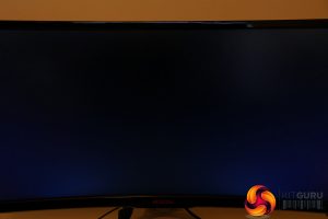
This effect is why I tend to recommend IPS over VA for most purposes. However, here it’s is less noticeable than usual, plus it does depend how you intend to use the screen. If you sit a bit further back – 1m as opposed to 0.5m away – then the effect lessens. Plus, if you intend to use the display to sit back and watch video then, again, the effect reduces as you move further away, and the high contrast makes up for it.
To further test just how accurate the colour performance of this display is, I fired up our display calibration software and a couple of different colorimeters. I use both the Spyder5 with Spyder’s own software, as well as the Xrite iDisplay Pro with DisplayCal software. This is because the Spyder 5 tends to underreport black levels, and thus contrast, but does a better job with reported Delta E (the ability of a display to distinguish between fine differences in colour).
Starting with that all important contrast figure and this display just about lives up to AOC’s claimed 2000:1 figure, with a figure of 1960:1. The Xrite and DisplayCal test also reports a plentiful maximum brightness of 361nits, accurate colour temperature of 6606K and 99% coverage of the sRGB colour space.
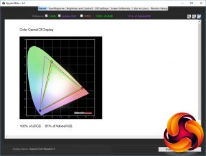
Moving onto the Sypder5’s tests and it backs up that this display can perfectly reproduce the full range of sRGB colours, with a 100% score. It will also reproduce 81% of the AdobeRGB space.
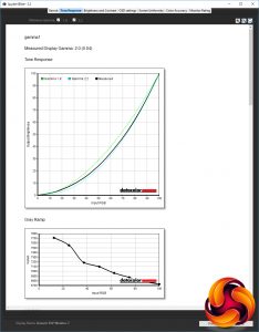
Next up is the tone response, or gamma, test. The gamma value affects how light or dark an image looks, with a higher value resulting in dark portions of an image looking darker. The computing standard is 2.2, and here we can see that this display matches this figure using its gamma3 setting. The default of the display is gamma1 so you’ll want to change this if colour accuracy is paramount.
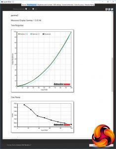
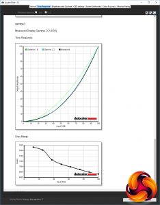
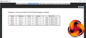
Next up is the brightness and contrast test. We’ll ignore the contrast figures but you can see that there’s a nice variance in brightness as you change the OSD settings and you can see that the white point (i.e. colour temperature) remains reasonably close to the ideal of 6500K. You could easily get away with doing nothing else to this display other than lowering its brightness and changing its gamma to the third setting.
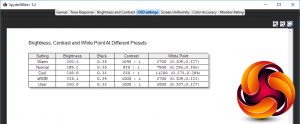
Next up we test the different colour temperature settings according to the OSD. You get the choice of Warm, Normal, Cool, sRGB and User and we can see that the default Warm setting is very close to what we want, and certainly close enough that most users should feel little need to mess around with any colour settings.
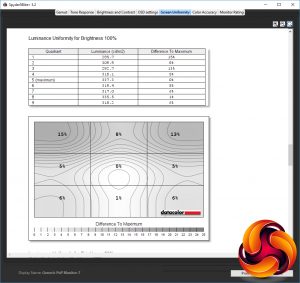
For such a big and curved display, it’s a particular challenge to ensure the display remains consistent-looking across its whole surface, but in the Sypder5’s uniformity test, it proved to be just that. Drops in brightness of 15% and 13% in the top left and right corners show it’s certainly not perfect but these figures still aren’t too bad, and on average the screen only varies by 6.5%.
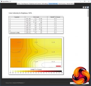
Slightly more of a concern is that colour varies by as much as 4.4% from the right to the left of the screen. This is all but imperceptible to the eye but is still a little higher than we’d like to see.
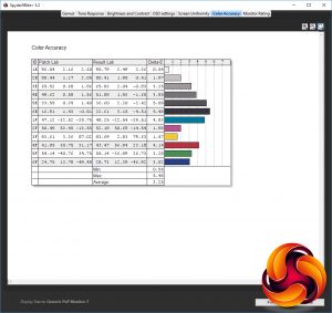
Also slightly higher than we’d hope is the colour accuraty of the display, with the Spyder5 reporting a Delta E average of over three. Normally we’d hope to see closer to one. Nonetheless, this is still an okay figure that shows this display can pick out fine differences in colour.
All told, this display may not be absolutely perfect right out of the box but largely its failings are academic, as they’re small enough to be imperceptible and it’s mostly on par with its competitors.
However, if you’re in the position to calibrate your screen then even better results can be eeked out of the AG352UCG. Switch to the User colour temperature and adjust the RGB values from 65x65x65 to 65x63x62 (your mileage may vary) and colour accuracy is near perfect.
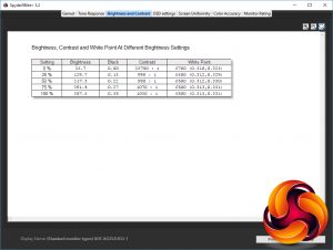
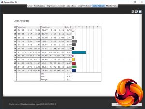
In the brightness and contrast test we can see that it’s nearly a clean sweep of perfect 6500K results, while the colour accuracy test now shows an average of 1.12. You can’t get much better than that.
Gaming
The two big downsides of VA LCD panels are the slightly worse viewing angles outlined above and a slower response time than IPS. So sluggish can the pixels of these displays be that some 100Hz+ VA models have been all but pointless because of the sheer amount of blur introduced.
However, the AG352UCG doesn’t suffer this fate. Fire up the BlurBusters motion blur test and it’s plane to see that this display does produce long ghosting trails (left) but in-game it didn’t feel as mushy as the AOC C3583FQ, for instance. You can also reduce the blur by upping the overdrive setting, though as ever this can introduce a strong corona effect (right).
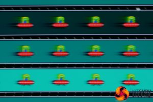

The upshot is that for hardcore gamers this isn’t the obvious choice of display but it still provides a nice bump in responsiveness over 60Hz models. The IPS-based PG348Q and X34A have a slight edge in terms of pixel response but it’s close enough not to be an absolute deciding factor.
Meanwhile, G-Sync works as well as ever and in fact the combination of the ultra-wide aspect ratio, the curve, the sheer screen size, high resolution, smooth performance of G-Sync and the high contrast makes for a fantastic experience in games where you just want to get lost in the virtual world.
 KitGuru KitGuru.net – Tech News | Hardware News | Hardware Reviews | IOS | Mobile | Gaming | Graphics Cards


