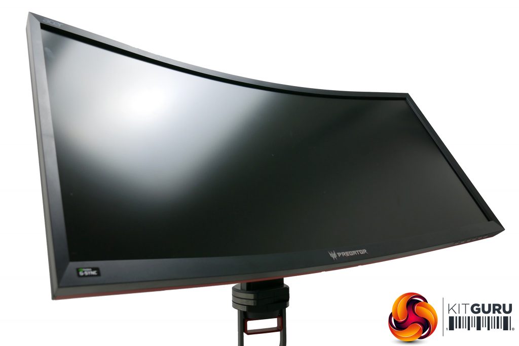
The most obvious thing about the Acer Predator Z35P display image is its curve. The way the sides project out towards you helps to create more of a sense of surround vision. Plus, it keeps the viewing angle and distance of the whole panel even, making for a more consistent image. Some dismiss the curve as a gimmick, but it really does work.
Also very obvious is the high contrast of this display. Sat next to a more common TN or IPS display, the deeper black level is plain to see, and certainly if you’re watching a movie in a darkened room, this greater sense of true blackness really enhances the immersion.
On the other hand, less of an immediate positive is that this display, can sometimes look a touch oversaturated. For already bright and colourful images it’s not a problem – especially in isolation. However, in particular it can sometimes make skin tones look a bit a off – faces looking far redder and blotchier than in real life.
Then there’s the viewing angles of this display. VA panels tend to sit somewhere between IPS and TN when it comes to viewing angles. They’re much better than TN, with none of the obvious colour changes when viewed off dead centre, but there’s more of a change in black level compared to IPS.
The upshot is that while colours look consistent, there can be a greyness that creeps in when viewed from more of an angle. Sit in a normal position – about 50cm away with the top of the screen inline with your eyes – and the bottom and edges of the screen can look a touch greyer than the centre. It’s a subtle thing but, again, when compared side by side with an IPS display, you can see it clearly.
What helps a great deal here is if you sit back from the screen slightly. At about one metre away the relative viewing angles have tightened up and the whole image looks much more consistent.
All told, it’s a fairly typical VA screen with the usual pros and cons that define this LCD panel technology.
With our more subjective observations done, it's time to fire up our colorimeters to see exactly what this display can do when it comes to colour accuracy. Two colorimeters and two programs were used to test the display. The first was an Xrite iDisplay Pro, which was used with the DisplayCal software, and the second is the ColorMunki Spyder5 accompanied by the Spyder5 Pro software. The iDisplayPro gives a more accurate contrast reading while the Spyder 5 is better for most other aspects of our tests.
Starting with the iDisplayPro, Acer’s claims about the Z35P’s contrast are proven to be true, with a reported figure of 2020:1. This test also puts the default colour temperature at a reasonable 6295K (the ideal is 6500K), while sRGB colour space coverage is 98.9% and gamma is a near perfect 2.19. Those are largely very impressive figures that show this screen is more than capable of producing accurate looking colours.
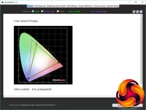
Moving onto the Spyder5 tests, the first test looks for how much of the standard colour spaces the screen can deliver, and it gets a perfect 100% for the sRGB colour space, along with 81% of the AdobeRGB colour space.
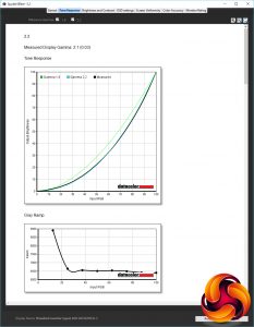
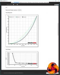
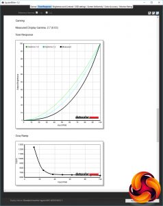
Next up is the tone response, or gamma, test. The gamma value affects how light or dark an image is, with a higher value resulting in dark portions of an image looking darker. The computing standard is 2.2, and although the screen has a setting that reports to be 2.2, it doesn’t quite meet that in our tests, instead coming just short at 2.1. This is close enough not to worry us too much, though.
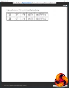
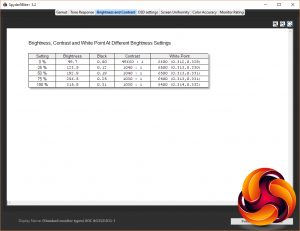
Next up is the brightness and contrast test. It’s here where the Spyder5 doesn’t correctly report the contrast but otherwise we can see that the maximum brightness is plentiful and the brightness scales nicely as you reduce the monitor’s brightness setting – some monitors handle this poorly with brightness dropping too fast or too slow, making it difficult to pick out your preferred level.
We can also see that the Spyder5 reports the colour temperature as being consistently very close to the ideal of 6500K so the screen doesn’t have a strong blue or orange tinge to it, as happens when this figure is too high or too low.
Next up we test the different colour temperature settings according to the OSD. You get the choice of Warm, Blue Light, User, Cool and Normal, with Warm being the default option. Our tests show Acer is right to choose this option for the default as it’s the closest to the ideal of 6500K. Switch to the User mode and it’s also close. Choose this option and adjust the colour balance manually and colour temperature can be brought perfectly into line.
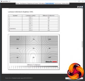
The uniformity test is next and it shows that despite being such a large monitor, the Z35P is surprisingly consistent across its whole surface. Peak variance in brightness of 14% isn’t great but on average it wavers by just 8%. That's far from the lowest we’ve seen but not enough to be a major concern either.
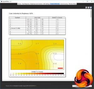
Uniformity of colour is even better, with an average of just 2.16% variance and a peak of only 3.0. That’s a very good result.
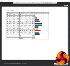
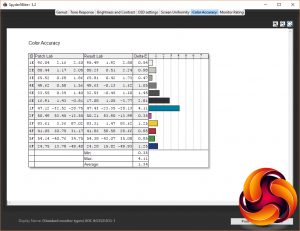
As for the display’s ability to properly represent fine differences in colour, it nailed this too with an average Delta E score of just 2.39. Anything lower than 3 is considered imperceptible to the human eye.
All told, this display has very good image quality right out of the box. In a perfect world its colour temperature would be even better, but unless you’re working on colour-critical projects like video and photo editing then it’s fine.
However, if you’re in the position to calibrate your screen then even better results can had. Switch to the User colour temperature and adjust the RGB values from 50x50x50 to 50x48x50 (your mileage may vary) and colour accuracy bumps up a notch, with more accurate colour temperature and an even better Delta E score.
Gaming
VA LCD panels have two main downsides, which are the slightly worse viewing angles outlined above and a slower response time than IPS. Some gaming displays with VA panels can feel so sluggish that they basically fail at being good for gaming.
However, the Acer Z35P doesn’t suffer this problem. Fire up the BlurBusters motion blur test, for instance, and there's less visible ghosting than on some previous VA displays. This can also be reduced further by upping the overdrive setting, though it doesn’t fundamentally change the overall feel of the display.
That feeling being that it’s definitely a step up from 60Hz monitors but it’s still some way behind the snappy feel of 144Hz TN displays. Perhaps more crucially, it feels just a smidge slower than IPS rivals, the Acer X34 and Asus PG348Q.
The 120Hz overclocking ability also does little to really change this, plus it reduces image quality slightly so there’s a trade off to be had there.
As for G-Sync, it works as well as ever. What’s more, it’s with displays like this where it really shines. The vastness of the screen and the overall image quality combined with the smoothness of G-Sync means you have a thoroughly absorbing gaming experience, even if it isn’t the fastest responding.
 KitGuru KitGuru.net – Tech News | Hardware News | Hardware Reviews | IOS | Mobile | Gaming | Graphics Cards



I have the x34a.
Do the corners have light bleed?
My x34a is terrible for light bleed when viewing a black screen. I’m starting to wonder whoever I have a dodgy one or not.
Also the buttons are a pain on the x34a. The back button changes position depending on which menu you are in and drives me nuts!
Is this different on the new one as it appears to be the same?
Also is the stand different?
I had to get a desk mounted arm for my x34 as I couldn’t get the monitor close enough to me as the keyboard and mouse got in the way of the stand.
I was hoping for OLED gaming monitors now.
Ultra widescreen is awesome for FPS games but if you try and watch a 21:9 film in powersdvd, it won’t fill the screen for you!
Wooden leg movies in MPC do though!
There’s forum posts on the cyber link forums complaining about it.
Looks like I’ll wait for the proper next gen displays as this feels like a stop gap to me.