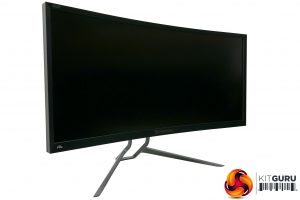
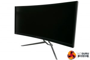
One area where the Z35P immediately has a lead over the AG352UCG is in design. The Z35P is a much cleaner, smarter-looking affair with a more dainty stand, slimmer bezels and more subdued matt black finish. In particular, the lack of lights on the bottom edge and the choice of matt black for the bezel makes for a far less distracting frame.
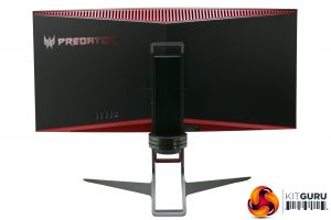
Round the back things are a little more jazzy, with two metallic red V-shaped sections brightening things up, plus the bulk of the back panel has a black, brushed plastic finish. It adds just enough flair without crossing over into being gaudy or tacky.
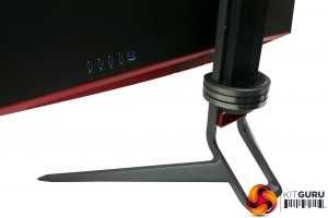
The stand is also particularly nice. The base is solid metal with a lovely dark grey finish, and it’s impressively slim yet secure. The stand also offers height adjustment and rotation, the latter of which is particularly smooth and easy to adjust. A handle on its top also makes moving the monitor a breeze.
You don’t get the ability to pivot the display into portrait mode, but on a huge curved display like this there seems little reason why you’d ever want to. You can also remove the default stand and fit an alternative one via the 100x100mm VESA mounting points.
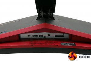
Connectivity is somewhat limited by the fact this display uses G-Sync – G-Sync modules only ever accept two inputs – but you do at least get both of these, with one DisplayPort and one HDMI.
Alongside these is a headphone jack, though there’s no pass-through for microphone so you’ll have to hook your headset’s microphone lead directly to your sound card instead.
Speakers are also included but, don’t be fooled, the sheer size of this screen doesn’t translate into a proportionally huge sound. They’re certainly a step up from the cheapest monitors, with more depth and detail than most, but even a £20 pair of desktop speakers will be a big upgrade.
The final main physical feature is a USB hub that sits on the rear of the display. Oddly it’s entirely kept separate from the rest of the connectivity and sticks straight out, rather than facing down. It’s an odd arrangement as it means you get neither the true convenience of ports mounted on the side of a screen, nor the tidy cabling benefits of having them more centrally positioned with the other connectivity. Regardless, you get four USB 3.0 ports, which is plenty.
Finally, we come to the screen, which measures 35-inches from corner to corner and has a resolution of 3,440 x 1,440, for a pixel pitch of 108ppi. This is just about perfect, providing a nice balance between being sharp enough to not look pixelated but still being large enough to be readable.
The screen has a 4ms response time and runs at 100Hz, but can also be overclocked to 120Hz. This puts it firmly into gaming monitor territory, though 144Hz TN screens with 1ms response time are still going to have a clear advantage for fast-paced gaming.
 KitGuru KitGuru.net – Tech News | Hardware News | Hardware Reviews | IOS | Mobile | Gaming | Graphics Cards


I have the x34a.
Do the corners have light bleed?
My x34a is terrible for light bleed when viewing a black screen. I’m starting to wonder whoever I have a dodgy one or not.
Also the buttons are a pain on the x34a. The back button changes position depending on which menu you are in and drives me nuts!
Is this different on the new one as it appears to be the same?
Also is the stand different?
I had to get a desk mounted arm for my x34 as I couldn’t get the monitor close enough to me as the keyboard and mouse got in the way of the stand.
I was hoping for OLED gaming monitors now.
Ultra widescreen is awesome for FPS games but if you try and watch a 21:9 film in powersdvd, it won’t fill the screen for you!
Wooden leg movies in MPC do though!
There’s forum posts on the cyber link forums complaining about it.
Looks like I’ll wait for the proper next gen displays as this feels like a stop gap to me.