The i-Rocks K10 is an inexpensive keyboard and as a result, the packaging is actually quite modest.
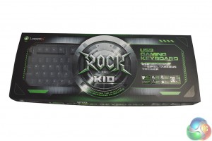
You get a slim, compact box, with a nice big logo printed on to it.
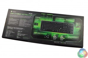
As usual, the back of the box is where you'll find most of the product information, giving you a brief run down of what you can expect in terms of standout features.
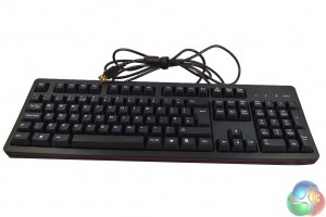
At first glance, the keyboard appears to be going with a green color scheme, which would be great if the design was consistent. The box has lots of green on it – the few lights on the keyboard are green- even the POM switches stick to the apparent color scheme.
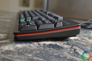
However, for some reason, there is a red trim going around the edge of the keyboard which does look a bit out of place. We would like to see a consistent color scheme on future product iterations.
As you can see in the image above, there is a slight upwards curve to the keyboard, which should theoretically make typing more comfortable.
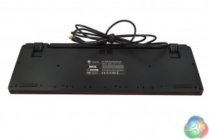
The keyboard doesn't come with any audio inputs, extra USB slots or a braided cable. However, there is a cable management groove on the back of the keyboard along with a set of standard rubber feet.
i-Rocks uses its own style of keyboard lettering, much like Razer does with its keyboards. The space key is the only one to be backlit as it has the company name on.
The first thing I noticed about the i-Rocks K10, is how heavy it was- giving off the impression that it is a well built product as soon as you pick it up. While it is primarily made out of plastic, the keyboard feels very durable.
Upon unboxing, it's clear that i-Rocks has put a lot of effort in to ensure that the K10's build quality is up to scratch. Now let's see how it performs…
 KitGuru KitGuru.net – Tech News | Hardware News | Hardware Reviews | IOS | Mobile | Gaming | Graphics Cards


Does the force required to make a key press be compared to MX Black switches?
How is this compared to my ageing MS SideWinder X6?