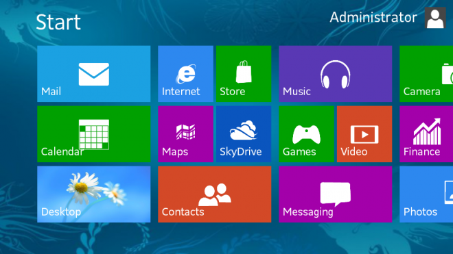
Microsoft has admitted that it knew most users wouldn't like the new Windows 8 Metro user interface but not for the reasons you might think, according to Jacob Miller, a UX Designer for Microsoft, “Familiarity will always trump good design. Even if something is vastly better, if it is unfamiliar it will be worse.”
The Metro design is quite a leap from the Windows layout we've all grown to know over the last 20 years, the new design tried to create a seamless transition between tablet and desktop use with its tile based icons which were similar to apps on the Windows Phone platform. While users still try to fight the new layout, Microsoft is thinking ahead and according to Miller, this is all part of Microsoft's long term strategy:
“The Windows 7 start menu IS better because it is familiar. We've used that design paradigm for the last 20 years. Metro is going to take some getting used to. As I mentioned, this is a long term strategy for MS. Hopefully in 5 years we'll look back and see we made the right decision.”
While the design change is debatable among users, Miller did end on a rather true statement as well as offering hope for the future: “Windows 7 couldn't have existed without the lessons we learned from the mess that was vista. XP couldn't have existed without 2000. Hopefully Windows 9 will be a solid refinement on all this.”
KitGuru Says: I had Windows 8 for a little while and over time I did get used to the tiles but I wouldn't go as far as to say I liked them. Windows 8 was faster in most cases but in the end I found myself back on Windows 7. Have you guys spent enough time with Windows 8 to get used to it? What did you think after extended use?
 KitGuru KitGuru.net – Tech News | Hardware News | Hardware Reviews | IOS | Mobile | Gaming | Graphics Cards


I have it on one machine and on a tablet. Its fine on tablet but ive installed traditional start menu back on pc
I’ve been using windows 8 since beta, and it did take some getting used to their “metro” ui. Biggest problem is their transition between the metro and the desktop. 90% of the stuff I do on my PC, it is in desktop mode, so I don’t ever see the metro ui unless I’m booting my PC up. There are alot of times that I wonder what the point is of having it if I’m never using it. Programs and apps need more of a seamless transition between the two.
One other problem I see is actually finding the programs you want to use in the metro design. The sorting of programs outside of the main “start” screen, trying to find something you want is a mess, jumbled and scary looking, where the original start menu, programs are sorted in easy to find folders in a simple scrolling menu.
The metro design is a good start, but needs alot of refinement.
I have used Windows 8.0 and 8.1 and I have found that 8.1 is VASTLY more useable than 8.0. They reintroduced the Windows key-commands and I find myself never actually using the tiles, and just using the Win+S command to search for the programs that I wish to use. I have been using 8.1 for about 2 months now and have opened the metro start menu maybe 5 times, tops.
I’ve been saying that this was Microsoft’s view all along:
“Familiarity will always trump good design. Even if something is vastly better, if it is unfamiliar it will be worse.”
Basically, Microsoft views its users as stupid and wrong, and refuses to consider the idea that they might have made a mistake. I agree – familiarity is very important compared with good design. However, applying that thesis to Windows 8 would require that it was in fact ‘good design’, which it quite simply isn’t. For tablet users, touch-screens, and maybe for gamers, it’s usable. However, for professional use it’s absolutely and completely worthless, as reflected in the pathetic take-up amongst businesses. Moreover, the advantages of Windows 8 don’t lie in the Metro UI itself but in the improvements made to base OS: for instance, it’s got a much lower memory profile as a result of dropping Aero, or, again, by including WDDM 1.2 it offloads to the GPU. The improvements that people have praised, in other words, have nothing to do with Metro, meanwhile those who do like Windows 8 do so because of those advantages and are almost always at best apathetic to Metro, frequently using Desktop view predominantly or even modding to make the UI more like 7. The minority who do like Metro are using a touchscreen – on which the OS does definitely make sense.
I’ve been using windows 8 and then 8.1 for quite some time now and I really enjoy the performance boost compared to 7. Might be just a placebo, but I like it. As for the Metro Screen, I don’t see it, installed the Classic Shell and my 8.1 looks basically like windows 7. I highly doubt that even in 5 years I’d be more ok with the Metro UI compared to the normal desktop and start menu. I may be old fashioned, but that’s who I am
I love how quick Windows 8 is to boot. I tried 8.0 and 8.1 but just couldn’t get on with Metro Screen so just bought and installed Stardock Start8 and havent looked back.
3 years on and it still looks fugly and feels clunky. Are you feeling optimistic?