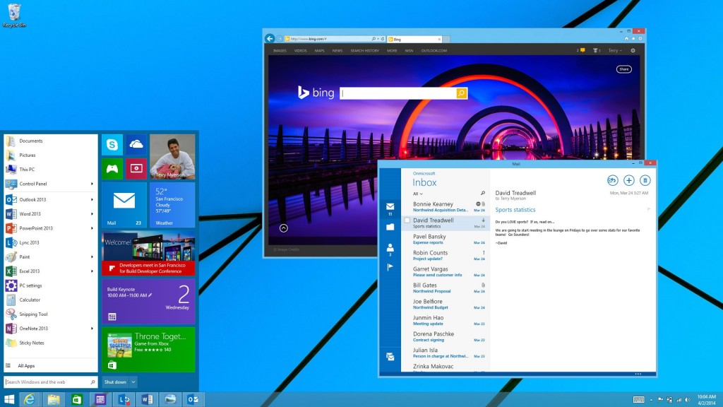
At this week’s Build conference, Microsoft Corp. demonstrated the look of the new Windows 8.1 update 2014 as well as a number of new capabilities of the modernised operating system. As expected, Microsoft returned a number of “classical” Windows elements and added some new features.
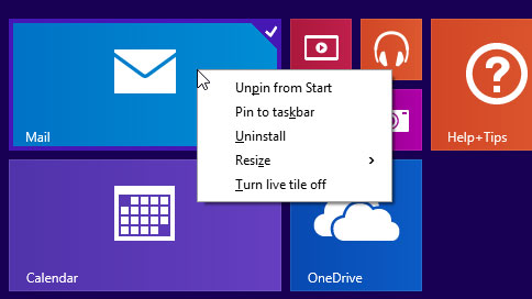
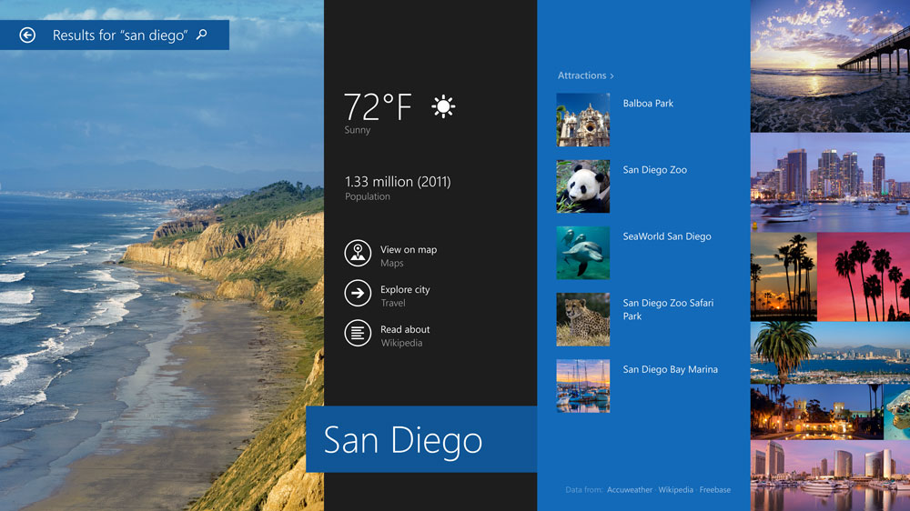
Key features of the Microsoft Windows 8.1 update include user interface improvements for “classic” mouse and keyboard users, boot directly to desktop on desktop/notebook PCs skipping Start Screen, the ability to access the taskbar from any screen and pin Windows Store apps to the taskbar alongside desktop apps and favorite websites, the ability to run Metro apps in windowed mode, improved search and so on.
The enhancements of Windows 8.1 offer faster, more direct access to the things that are used regularly, so activities such as powering down, searching the Web and switching between apps are easier. Navigating using the mouse and keyboard will feel more instinctive and familiar since there is more consistency with where controls are and how they work.
Essentially, the majority of the PC-related improvements of the Windows 8.1 update simply bring user experience closer to that of “now-classic” Windows 7, but without all the beauty the latter has. Still, if you have an ultra-high-definition display, you may still prefer the Windows 8.1 since it brings support for 250% – 500% scaling for desktop and desktop applications (at least, it should, based on unofficial information).
When it comes to the enterprise, Windows 8.1 update offers improved Internet Explorer 8 compatibility on Internet Explorer 11, extends mobile device management functionality, and eases deployment with increased predictability for new operating systems and line-of-business apps by leveraging familiar management tools.
Officially, the update is set to be released on the 8th of April, 2014. Existing Windows 8.1 customers will receive the Windows 8.1 update for free through Windows Update, while Windows 8 customers will receive the update free through the Windows Store.
KitGuru Says: Microsoft is in a tough situation these days. It needs to address both traditional personal computers as well as tablets/2-in-1s with one operating system. The company needs to have more or less the same graphical user interface (GUI), but to provide convenience to both “keyboard + mouse” as well as “touch-screen” users. Consequently, Microsoft ends up with the GUI that looks neither beautiful nor familiar, albeit it seems to be pretty functional. The problem here is that people like fine-looking things. Meanwhile, Microsoft and PC makers are trying to persuade end-users that slightly sleeker PCs with a moderately-looking OS that behaves just like Windows 7 can revolutionise their experience, so they need to upgrade now. Quite naturally, customers prefer to keep their existing systems and buy some additional gadgets to offload certain tasks from PCs.
 KitGuru KitGuru.net – Tech News | Hardware News | Hardware Reviews | IOS | Mobile | Gaming | Graphics Cards


