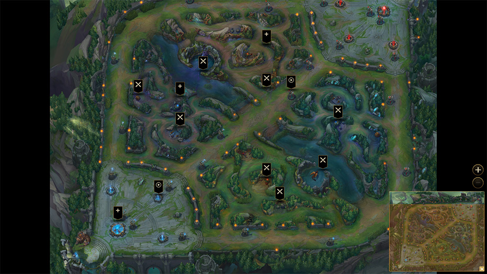
Riot Games announced earlier this year that for Season five of League of Legends, it was going to be making big changes to its most classic of maps, The Summoner's Rift. Now with the Season four World Championships behind us, those changes have come into effect and they bring a very distinct graphical overhaul, along with a number of big changes. Gone are the colourful, cartoonish aesthetics of the map and so too with many of the jungle's classic neutral mobs. Fortunately to help orient you before your first game on the new ‘Rift, Riot has released an interactive map that explains everything.
For starters, the two bases of each team are now very distinct. The southern base is built with more angular lines, while the northerly one features much more sweeping architecture, helping you know straight away just who you're fighting for.
Moving across the map, the next big change highlighted is adjusted inhibitor visuals. Now, once one is destroyed, a ring of light will appear around it. When the two halves connect, completing the circle, it will respawn, giving everyone an idea of how long that will be. [yframe url='http://www.youtube.com/watch?v=6sI7kPzp3y0′] Say goodbye to the wraiths and hello to the raptors
There's also new neutral mobs to face down, like Gromp, Red Brambleback and the Krugs, replacing some of the more generic enemies on the map that were there before.
Towers and other structures now also have visual damage cues, so as you wail away on them they'll crumble and start to fall apart, giving you a better sense of progression as you take down the enemy's buildings.
All of these changes and more are designed to not only make the map more competitive and open up new options for play, but also to make the map easier to navigate and understand from a newer player's perspective. Walls that can be flashed over will now typically be lower than those that can't. Areas of the map are skinned differently to help you remember where you are and a lot of the visual ‘clutter' that might have made you not quite fire off that ability in the right direction has been removed.
For a full list of changes, have a look at the map yourself, here.
Discuss on our Facebook page, HERE.
KitGuru Says: I like the overall look of the new map, but it does feel at lot more like DotA 2 now with its muted colours. I wonder if you guys feel that LoL has lost a bit of its visual identity with these changes?
 KitGuru KitGuru.net – Tech News | Hardware News | Hardware Reviews | IOS | Mobile | Gaming | Graphics Cards


