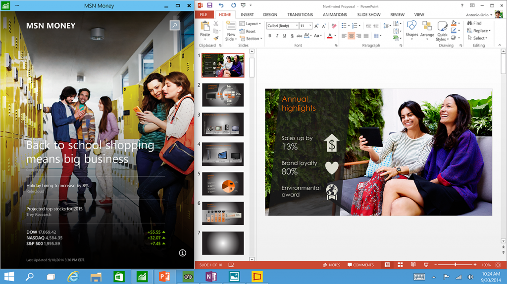
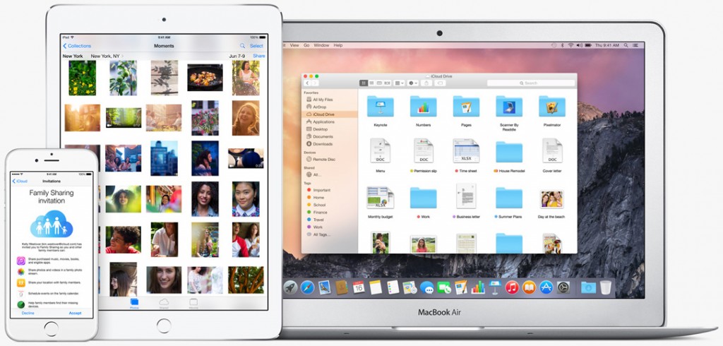
If you do not like modern graphics user interfaces of the latest operating, you will have to get over it because this is exactly how GUIs will look like going forward, according to a former Apple engineer. Flat is the new black.
Millions of users have criticized Apple and Microsoft Corp. for changes of user interfaces (UI) in their iOS, Mac OS X and Windows operating systems in the recent years. The new UIs lack the majority of skeuomorphic elements, are flat, minimalistic and very clean. However, in many cases they are not as intuitive or beautiful as previous-generation interfaces. Bill Fernandez, the first full-time employee of Apple and a well-known expert in user interfaces, believes that transition to flat UIs is just an inevitability.
“Years ago a friend asked what I thought Web pages of the future would be like and I said ‘like magazines,’” said Mr. Fernandez in an interview with Cnet News. “I thought we would see flatter designs, expert typography, beautiful, magazine-advertisement-like page layouts, etc. That prediction is coming true with the trend toward ‘flat' UI design.”
When graphics user interfaces emerged in the eighties and evolved in the nineties, many of their elements were skeuomorphic, made to recreate actual objects, goods or devices. This helped to make UIs more intuitive for people not familiar with particular programs as well as more stylish. Many skeuomorphic design elements outlived actual items they were to depicture. We no longer use diskettes, folders, sketching boards, notepads, players and many other things we used just a decade ago. As a result, there is no more need to emulate the “real world” on displays: elements on displays have become the real world for many, if not all users.
Since modern user interfaces no longer have to resemble anything, it is time to make them clean and intuitive. Unfortunately, some things get lost on this path. Eventually, developers will figure out how to make “flat” UIs perfect.
“In moving towards flat design we are losing much of the wisdom that was embedded in the old 3D style of UI, for example: a user must be able to glance at a screen and know what is an interactive element (e.g., a button or link) and what is not (e.g., a label or motto); a user must be able to tell at a glance what an interactive element does (does it initiate a process, link to another page, download a document, etc.?); the UI should be explorable, discoverable and self-explanatory. But many apps and websites, in the interest of a clean, spartan visual appearance, leave important UI controls hidden until the mouse hovers over just the right area or the app is in just the right state. This leaves the user in the dark, often frustrated and disempowered,” explained the legendary engineer.

Although it is an art to design user interfaces of software, Bill Fernandez reckons that visual design is only one element that users interact with. In reality user interacts with a lot of things and all of them have to be made very well.
“The true user interface is the gestalt of many things: industrial design, ergonomics, internal hardware, performance, error handling, visual design, interaction, latency, reliability, predictability, and more,” said the legendary engineer. “I am glad to see my profession moving from the concept of user ‘interface’ (where the user interacts with the screen) to user ‘experience’ (where more the above factors are considered),” said Mr. Fernandez.
Discuss on our Facebook page, HERE.
KitGuru Says: The ideas behind transitions to flatter designs are well known. The problems that modern UIs bring are also evident in many cases. Still, in many cases modern UIs are actually easier to use than older interfaces, which is why they will continue to evolve, whereas skeuomorphism as we know it will cease to exist.
 KitGuru KitGuru.net – Tech News | Hardware News | Hardware Reviews | IOS | Mobile | Gaming | Graphics Cards


Am I the only one in the world who REALLY HATE minimalistic and overlysimple layouts without ANY personality and depth? On phones and other small screens its “ok” because you can’t see anything if there is too much, but on a pair of normal 27″ish monitors it just looks wrong in all possible occations… Computers are a tool to EXPAND out creativity, not mush it down with the overuse of simple shapes :/ — furious greetings from Pork <3