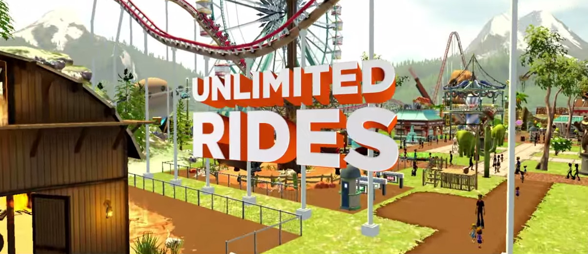
If the growth of indie developers in the past few years has taught us anything, it's that photo-realistic graphics are far from needed when it comes to enjoying a game. In-fact, it's often more important to find a unique visual style that fits its world, or at least tug on our nostalgic heartstrings. In the case of the new Rollercoaster Tycoon World game however, you have to wonder if the bar couldn't have been raised a little more, as the visuals are hearkening back to early ‘oos 3D and they are not charming in the slightest.
Bizarrely, in some shots there are some shadows for the rides, but not in caps like the above from the latest trailer. Textures are also incredibly low resolution, there's nothing dynamic about anything making what is detailed look static and if you spot a model that blends in with the environment, do be sure to let me know. [yframe url='http://www.youtube.com/watch?v=nzgAhPffWsM']
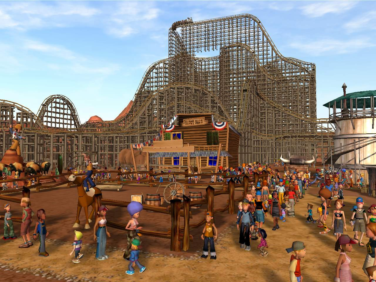
Although it seems unfair to judge a game on its visuals alone, especially before release and anyone's had a go on it, the fact that the graphics are worse than Rollercoaster Tycoon 3's (which came out in 2005) suggests that the effort put into this game is severely lacking.

RCT3. Even the people cast shadows here.
While we all ponder what happened at Area 52 for it to make a game that looks this poor (with oddly detailed, pre-rendered CGI cut in), the publisher Atari has plans for a release within the next couple of months. This isn't even a pre-production video.
Discuss on our Facebook page, HERE.
KitGuru Says: Perhaps the gameplay in the new Rollercoaster Tycoon will be great, but even if it is, it feels like a little more time could have been spent making it look good. At least add a couple of reflections to the water. It's just a static texture at the moment.
 KitGuru KitGuru.net – Tech News | Hardware News | Hardware Reviews | IOS | Mobile | Gaming | Graphics Cards


the guy at the end with the VIP badge is completely right about the game… 😀
Tbh the graphics do look quite outdated and lacking effort but there’s no way it looks worse than the blocky mess of RCT3
KitGuru, please stop disabling full screen viewing on your embedded youtube videos 🙂 Thanks!
Kitguru are you this desperate to badmouth games, you’re actually taking shots at works in process ? alot can change in 2 months time so wait until the devs say “we’re finished” before posting stuff like this.
no, not really…. 2 months is the end of a long journey when building games… the final 2 months is time for a bit of spit and polish and certainly not when a team should be adding textures and shadows.
doesn’t change the fact that Kitguru shouldn’t be saying shit like this on an unfinished game.. wait before the people making it say “we’re done” before bashing it… this is just being respect less.
What KitGuru is saying is mild in comparison to the comments of most RCT fans who’ve seen the video. If Atari release a video of something looking this bad, they can hardly expect people to ignore the shoddy graphics. Besides, I agree with John – two months is nowhere near enough time to fix the problems we can all see. This game needs another six months at least, preferably with a developer with some experience, which Area52 are sorely lacking.
Also when is responsive design coming? Its loooooong overdue now…
The Steam pictures look A LOT BETTER. They also have shadows just saying. Also love how kitguru is talking smack about a game without actually getting any hands on with the most important thing. GAMEPLAY
reson for no shadows is they can be very taking on the gpu/cpu.. and as for RCT3 it lags like massive ass with 5000+ peeps in the part due to things like shadows ect…
also dont let the shadows hit your ass on the way out
http://cdn.akamai.steamstatic.com/steam/apps/282560/ss_73fb2051b078fd95025fe3b30dac4a23ceeaff55.jpg?t=1425578356
RTC 2 will stay the best one again with that RTC world junk
Just look at watchdogs, 2 months after the demo and it decreased in graphical quality :’)
I remember buying RCT3 with the holographic cover and thinking it came with 3D glasses haha. Those graphics are little disappointing I agree, 10 years and no better?
If you don’t want people to critize your game, don’t make marketing materials that look like this. This trailer is to get people interested in the game, it should show the best of what the game is capable of. Apparently, that is not very much.
This is not an early beta or alpha build. Atari does not add disclaimers, so KitGuru has all the right in the world to bash it.
Jeez, just look at all the butthurt fanboys.
The fact the trailer starts with super HD graphics at the point where this game should be then switches to those early PS2 graphics just screams “this game is a joke”