From duct tape prototype, right through the developer versions to the final product, we've seen the Oculus Rift from its inception through to its consumer version, but not so with rival VR headset, the HTC Vive. Fortunately though we have VR Product Specialist at HTC, Shen Ye, tweeting out images of the various developmental versions of the headset and it's controllers; they've all gone through several iterations too.
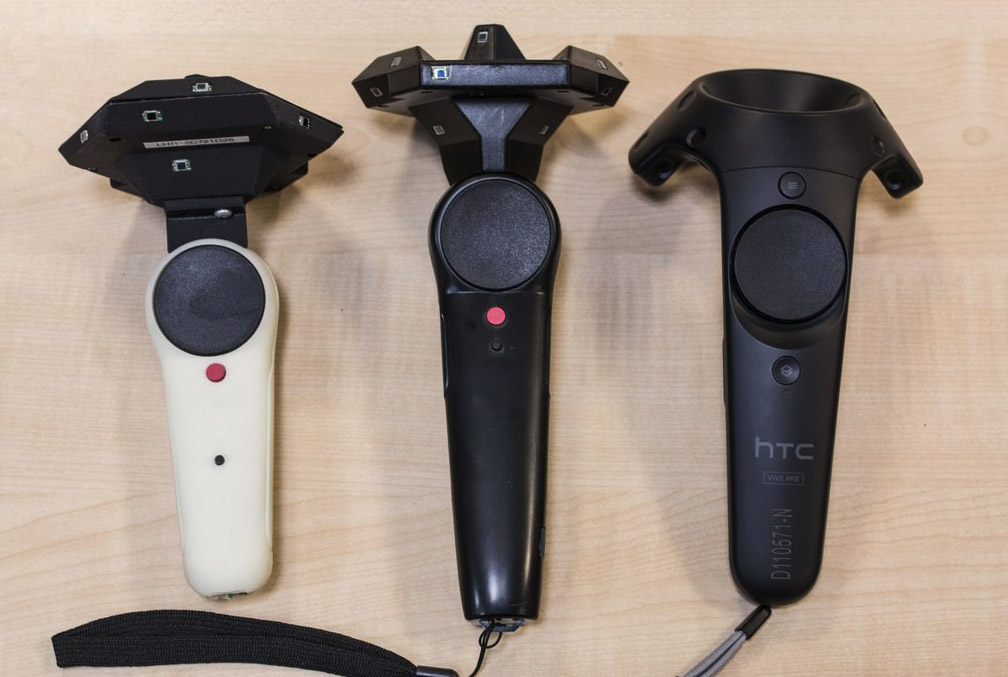
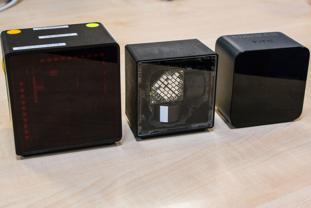
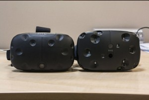
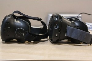
“A lot has changed in the last year,” he Tweeted, along with several images showing the lighthouse sensor boxes shrinking and refining, the wand controllers becoming more streamlined and easy on the eye and the drop in size and change in shape from the original Vive, to the Vive Pre.
The hand tracking, motion controllers have certainly grown more consumer friendly over time. The smaller sensor rig at the top too looks far more thought out. Dropping the beige was a good call too.
The lighthouse sensors have certainly grown smaller and smaller, but you can tell the last of the trio is the most commercially orientated, just by its nicer casing and branding.
In comparison, it doesn't seem like the headset itself has changed as much. The Vive Pre has a nicer headstrap though, with again, better branding, a reduced-size faceplate and just the single camera.
While we still don't know for sure if what's on show here is what HTC plans to put up for pre-order in February, but the tighter aesthetics certainly suggest as such.
Discuss on our Facebook page, HERE.
KitGuru Says: I really like the design of the Vive and the out-of-the-box room-scale and hand tracking is huge, but I don't like how rushed it seems. The Pre was supposed to be a new developer kit and yet just three months after its sending out to developers HTC plans to ship to consumers? I don't see it happening on any meaningful scale.
 KitGuru KitGuru.net – Tech News | Hardware News | Hardware Reviews | IOS | Mobile | Gaming | Graphics Cards


