Mozilla, the foundation behind Firefox, not the browser itself, is looking to revamp its logo. That means ditching the red T-Rex head of yesteryear in favour of something new and it wants its community of users from around the world to help it decide. What's your preference?
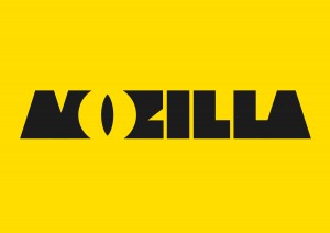
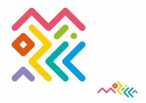
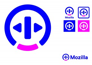
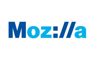
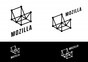
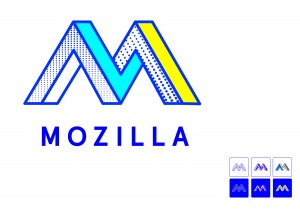
The redesign idea was announced earlier this year, as well as the news that Mozilla had hired on the skills of British design firm, Johnson Banks, to develop a number of concepts, which would then be put to Mozilla fans for the final verdict (thanks Ars). Well now we have those designs and they range from retro, to dystopian.
The designs are out there for all to see and Mozilla is soliciting feedback on them. Essentially, we're within the concepting/refinement period and with commentary from Mozilla fans, it hopes it can pick a logo and design style that fits in with the company's ethos and what it plans moving forward.
Important considerations for those that want to throw in their ideas, should be how the logo will resonate around the world, does it have the potential to show off modern technology, is it scalable for a variety of products and would it make people rethink Mozilla?
That last point may be the most important, as a redesigning of a logo is about doing that – changing the face of an organisation.
If you'd like to comment directly to Mozilla, you can do so on the official blog.
Discuss on our Facebook page, HERE.
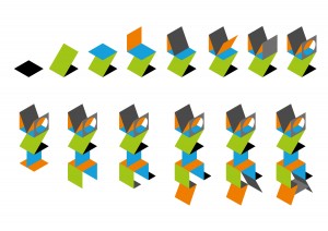
KitGuru Says: Do you think these designs help change the face of Mozilla? If I had any say, I'd probably opt for the last one. The unfolding box looks interesting and quite scalable.
 KitGuru KitGuru.net – Tech News | Hardware News | Hardware Reviews | IOS | Mobile | Gaming | Graphics Cards



I currently make in the range of $6000-$8000 /month from freelancing online. Everyone willing to complete easy freelance work for 2h-5h each day from comfort of your home and get good profit in the same time… Then this job is for you… UR1.CA/pm79v
bhu76