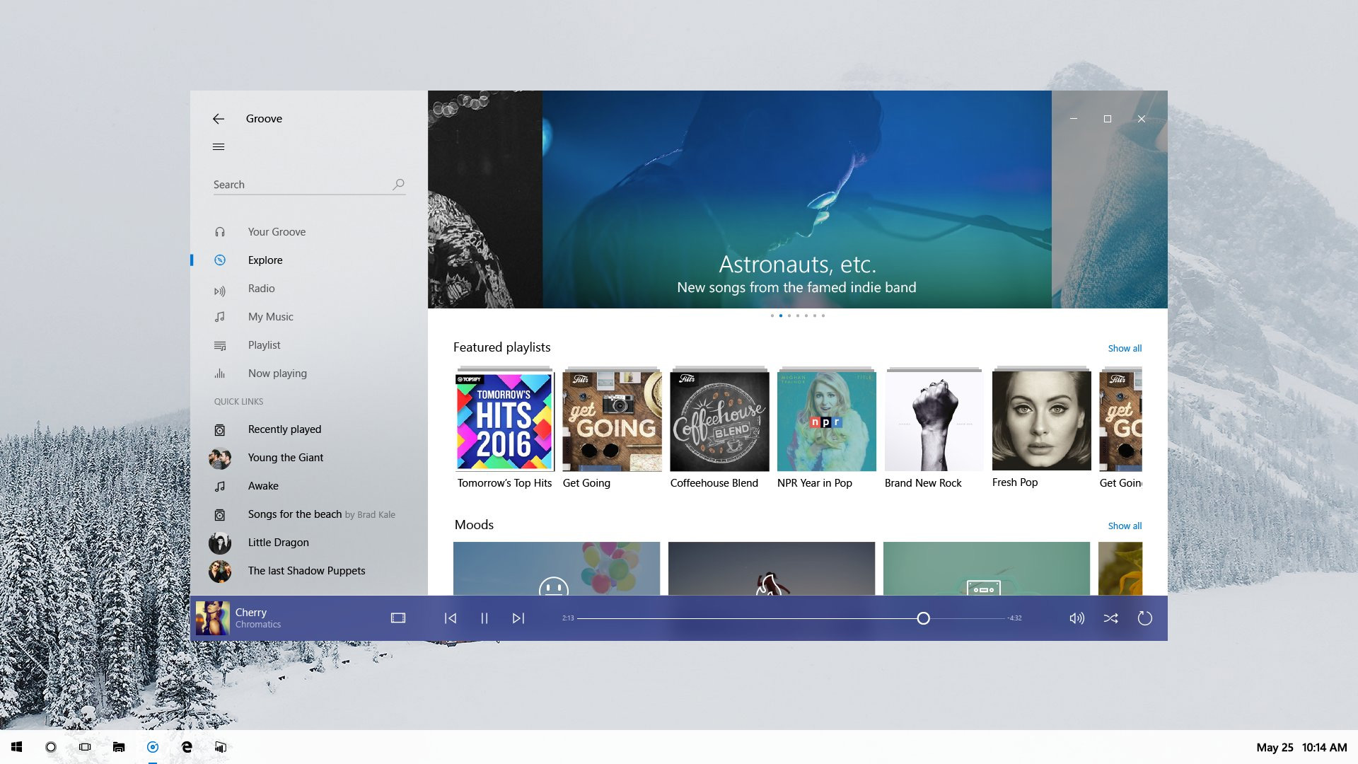
Microsoft is going to be changing the way Windows 10 looks, or at least empower application makers to do so. Project Neon is a currently unannounced feature that we all know is coming to Windows 10 and this week, during a developer day livestream, Microsoft inadvertently revealed it.
We have seen hints at Project Neon before now, with developers showing off previews of their applications, but this is the first time that Microsoft has given us a look in any official capacity. It's not clear it if intended to – it certainly didn't announce it as part of the livestream – but this is a very real confirmation that Project Neon is coming and it's going to make Windows 10 much more aesthetically pleasing.
Looking a little like the Windows 7 aero glass visual update, Project Neon adds a lot of new transparency features to Windows 10. It makes the user interface cleaner and adds animations that make it all flow together – a little more like Apple's operating systems.
Source: Tom Hounsell/Twitter
Although it's arguably been possible to have such visual flair in Windows 10 apps since the OS was released, it wasn't a focus under the Metro theme and certainly wasn't easy to implement. With Project Neon though that should change and we could see a lot of Windows applications suddenly looking much more contemporary.
One area which is drastically different under Neon though and won't require app-maker input, is the Windows 10 taskbar. In this screenshot it's near-white, which could be its way of mirroring the wallpaper content, but may also be a new design style for the taskbar under Neon. Icons too are silhouetted and monochrome, and the search bar has disappeared into a small icon instead.
Some colour does appear to be added when an app is running or in the foreground though.
Discuss on our Facebook page, HERE.
KitGuru Says: What do you think of how Project Neon looks to overhaul the look and feel of Windows 10? Do you think the OS needs a bit more visual flair?
 KitGuru KitGuru.net – Tech News | Hardware News | Hardware Reviews | IOS | Mobile | Gaming | Graphics Cards


the taskbar .. holy fuckign hell, did a kinder “designed” it in Paint?
Much prefer the taskbar looking like this. Very minimal and sleek.
Reminds me of back when you could customize Windows 7 visual themes fully. Give us more options to do this sorta stuff!
Everything in the picture is so ugly, Windows 10 is ugly now but that image takes it to a whole new level of ugliness.
Man the people who talk all this shit….
I upgraded to Windows 10 for free, from shitty windows 8. As a gamer, windows 10 is important for DX12 applications, it has undesirable “features” that i could do without being there, but every OS does. the OS runs smoother than 7/8, games run better and have access to better rendering methods and as that is the main use for my PC, its important to me that they are keeping on top of making the end user experience one that is closer to what every windows user is familiar with. Im sure as with all other cosmetic changes in windows 10, they will be optional. Shut up with your fucking whining already.
If you right click the taskbar in Windows 10 you can already set the search bar to either be small or be disabled completely. 🙂
No one is whining….
Google is paying 97$ per hour! Work for few hours and have longer with friends & family! !mj76:
On tuesday I got a great new Land Rover Range Rover from having earned $8752 this last four weeks.. Its the most-financialy rewarding I’ve had.. It sounds unbelievable but you wont forgive yourself if you don’t check it
!mj76:
➽➽
➽➽;➽➽ http://GoogleFinancialJobsCash236HomeFactoryGetPay$97Hour… ★★✫★★✫★★✫★★✫★★✫★★✫★★✫★★✫★★✫★★✫★★✫★★✫★★✫★★✫★★✫★★✫★★✫★★:::::!mj236:….,……
i hope this is just an optional theme