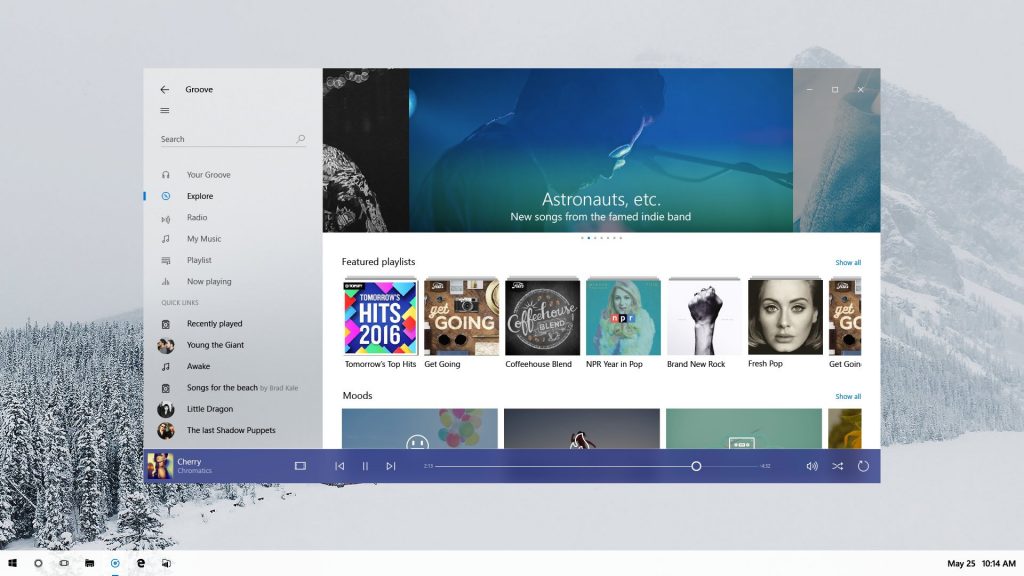
We are continuing to make our way through Microsoft's new announcements coming out of the Build 2017 conference. Aside from some new additions to the Windows Store and future VR headsets, Microsoft also detailed its next big feature update for Windows 10. This is going to be ‘part two' of the Creators Update, which began rolling out last month, adding in a new ‘fluent' design, along with several other big features.
For starters, the next Creators Update is coming during the Autumn and will feature the new ‘Fluent Design System', previously known as Project Neon. We got our first look at this new design back in February. This is essentially Microsoft's effort to replace the ‘Metro UI' style we first saw introduced with Windows 8, which received wide criticism.
Timeline is another key feature. This is a reworking of the Task View area, allowing you to see apps that were previously open on other devices. The idea is that you can start a project on Office 365 on a phone or tablet, and then check the Timeline to pick up where you left off when you have returned to your usual PC.
This new ‘pick up where you left off' feature is something that Microsoft hopes will attract developers. This would allow Windows users to resume their sessions on multiple devices , whether they are using a secondary Android or iOS device in addition to a Windows PC.
Finally, there is also a new ‘Clipboard' feature, which will also be viewable on Windows and Android/iOS. This allows you to copy and paste information from a PC and have it appear on your other devices.
That isn't all Microsoft has planned for its second Creators Update but it is all the company is sharing for now.
KitGuru Says: As someone who uses a PC in addition to other platforms for work, these new features interest me quite a bit. Do many of you ever need to frequently switch which device you are using? Would this new feature update end up being useful to you?
 KitGuru KitGuru.net – Tech News | Hardware News | Hardware Reviews | IOS | Mobile | Gaming | Graphics Cards


what phone ffs? Give us new devices microsoft wth? You spent all those years pushing and now that finally the store have enough apps to worth it you stop?
Looks good I like the new look but I do hope that task bar being white was just for the picture that would drive me nuts. The only downside of all this sharing between devices is it wanting you to be connected so all your stuff is shared into the cloud at all times. I would assume this feature can be turned on or off.
I really like the look of this. The images of the file explorer scare me though. That’s going to be a tough one to get used to. Change can be a hard thing sometimes.
flat design is so 1975-ish