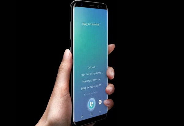
While the Samsung Galaxy S8 did enjoy plenty of positive reviews, many owners have had one complaint in common- the Bixby button. Samsung's AI-driven digital assistant has its own dedicated button on the side of the phone, which has been getting in the way for many users. Thankfully, Samsung is finally letting Galaxy S8 and Galaxy Note 8 owners disable it.
When the Galaxy S8 first began rolling out, developers did offer third-party apps to allow users to re-assign the Bixby button to something more useful. Unfortunately, Samsung really wanted that button to remain tied to Bixby, so it began blocking those applications.
With the Galaxy S8 and Note 8's latest software update from Samsung, the company is backing down slightly. Going forward. users will be able to disable the Bixby button within the phone's settings. However, Samsung isn't giving you the tools to re-assign it to something else.
If you own a Galaxy S8 or a Note 8 then you should see the update fairly soon. SamMobile has already confirmed that the update is rolling out to existing handsets, so keep an eye out if that Bixby button has been bothering you.
KitGuru Says: Samsung is still being quite stubborn when it comes to the Bixby button. Surely it would be better to allow users to re-assign it to something more useful to them than to just disable it entirely. Perhaps the company will see reason eventually. Do any of you currently have a Galaxy S8? Has the Bixby button bothered you at all?
 KitGuru KitGuru.net – Tech News | Hardware News | Hardware Reviews | IOS | Mobile | Gaming | Graphics Cards


I feel this is going be a bit like the useless alert slider that oneplus introduced to their phones that doesn’t do a lot for notifications unless you use third party sorftware to reassign it. As rather than a default; loud, vibrate, silent. It uses priority notification settings
I’ve got an S8+ and am constantly hitting the button when I’m turning off the screen, and also, when I put the phone into my RAM-style mount on my bike, I have to have the phone dangling off to one side because if I have it more centrally located, two of the prongs sit directly on the Bixby button AND the power button…it’s a tad inconvenient, but I live with it.
I HATE the Bixby button, it is beyond annoying