Yesterday it came to light that Valve would be putting out an updated and refined version of Counter-Strike’s most iconic map- Dust2. At the time, we only had one screenshot to look at but now, Valve has released a full look at the new version of the map, which makes some notable changes.
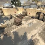
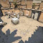
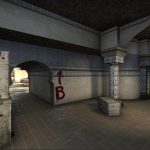
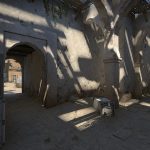
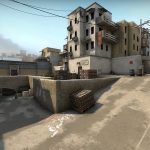
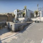
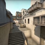
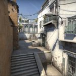
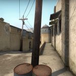
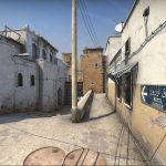
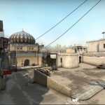
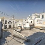
The developers had three main goals for the updated version of Dust2. They wanted to improve player readability throughout the map, refine movement around the map as well as to and from cover spots. Finally, the team also wanted to upgrade visuals to bring Dust2 more in line with other modern maps. In the gallery below, you can see the before and after comparison screenshots taken by Valve. Please note, if you are running an adblocker, the gallery may not appear correctly for you.
Bombsite B:
Bombsite A:
Mid:
T-spawn (B-side):
As you can tell, artistically, the new version of Dust2 is quite different. The Bombsite B section of the map is now based on a historic Kasbah under restoration, meanwhile Bombsite A is a bazaar and hotel. Valve has quadrupled texture resolution and introduced some new character models to go with it.
The new version of this map is now going out to those who opt in to the CS:GO beta on Steam. Valve will be monitoring feedback and adjust things where needed before rolling the map out to everyone.
KitGuru Says: Dust 2 is one of my all time favourite maps. For the most part, the map should play similarly to the way it did before, though there are some new cover spots to learn. What do you guys think of the new version of Dust 2?
 KitGuru KitGuru.net – Tech News | Hardware News | Hardware Reviews | IOS | Mobile | Gaming | Graphics Cards



Looks quite nice, actually!
Doesn’t look that bad! Thoughts on this: http://www.esportsinsider.com/2017/10/unikoingold-becomes-largest-ever-gaming-esports-token/