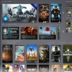
As far back as 2013, we have been hearing about Valve's plans for a Steam UI overhaul. There have even been multiple leaks of what the new library screen might look like. Now this year at GDC, Valve is finally going forward with its plans, showing off the newly spruced up version of Steam for the first time.
We saw the beginning of this UI overhaul last year when Valve revamped Steam Chat. Now, Valve is also showing off what the new library and event menus will look like:
The new library design makes better use of screen space by including a friends list on the right hand side of the screen. When you click on one of your games, your stats will appear underneath the play button, including time played, achievements etc. Finally, news and events surrounding the game you have selected will appear underneath, alongside trading cards you might own and recent friend activity. Many of this features are in the current version of the Steam library but the overall presentation has been improved.
The new Steam Events page is also very different. This gives you a way of seeing what is going on in your favourite games, whether it is a big planned tournament or a double XP weekend. Users will be able to also set reminders about certain events, or ignore them completely.
Events you see on this page are powered by Steam's recommendation engine, with the hope being that you are only shown events you might actually want to participate in.
We don't know exactly when these two new updates will begin rolling out to Steam users but if the Steam Chat overhaul is anything to go by, it shouldn't take too long.
KitGuru Says: I'm looking forward to these updates finally rolling out. Steam has generally looked and functioned the same for almost a decade now, so this should freshen things up. Next, I would like to see an update to Big Picture mode, specifically with 4K support. What do you guys think of the upcoming UI changes for Steam?
 KitGuru KitGuru.net – Tech News | Hardware News | Hardware Reviews | IOS | Mobile | Gaming | Graphics Cards


