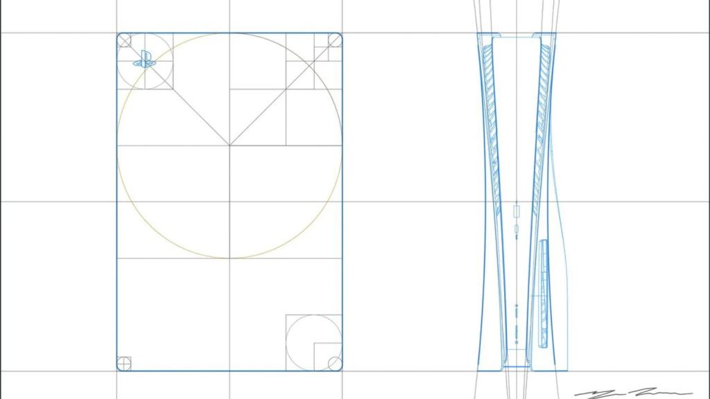
When the PlayStation 5 was first shown off, one of the main takeaways by many people was just how big the console is. While not the largest console in history, it certainly commands a great deal of space. Despite this fact, when the next-gen system was first concepted, it was designed to be even larger than it ended up being.
In an interview with The Washington Post, the PlayStation 5’s Senior Art Director and PlayStation 5 Designer, Yujin Morisawa, revealed that when he was first tasked with designing Sony’s next generation console, his mock-up was larger than that which ended up being the final design.
According to Morisawa, “When I started drawing, it was much larger even though I didn’t know what engineering was going to do. It’s kind of funny that engineering actually told me it’s too big. So, I actually had to shrink it down a little bit from the first drawing.”

Speaking more generally on the design philosophy of the PS5, Morisawa revealed that the many comparisons to household items such as routers was in fact an encouraging response, saying “When you design something, you want to make it feel comfortable. Sometimes it looks like a plant or some animal or some object. I think that’s more comfortable than something that’s weird, or something that they’ve never seen before.”
Whether you love it or hate it, there’s no denying that the PlayStation 5 has a striking design. It'll be interesting to see what the overall impression ends up landing at when fans are finally able to get their hands on the console in just a few days.
Discuss on our Facebook page HERE.
KitGuru says: What do you think of the PS5’s design? Is the console too big in your opinion? Do you like the two-toned look? Let us know down below.
 KitGuru KitGuru.net – Tech News | Hardware News | Hardware Reviews | IOS | Mobile | Gaming | Graphics Cards


