Google’s game streaming service, Stadia, launched back in late 2019 with a solid enough gameplay experience backed by an unfortunately subpar storefront, lacking many of the most basic functionalities expected. Over time, Google has slowly improved Stadia, with the latest update overhauling the store’s design.
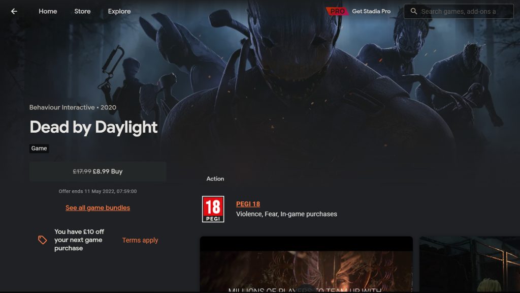
As reported by 9to5Google, the Stadia storefront has received a UI update, changing the way in which players will interact with the website as well as try or purchase games.
The most immediately noticeable change comes in the form of a reduction in visual clutter, with Google moving the screenshots section from the top of the page down and replacing it with a single banner representing the game in question – which then seamlessly transitions into a matching colour gradient as you scroll the page.
Other changes include the addition of pertinent information to the front of the page, such as whether a demo is available, or a time-limited trial – allowing you to much more easily try games before you buy them. Promotions for each game are also more prominently advertised, letting players easily know if there is a good deal going.
A small but sweet change is the way in which the website’s URLs are formed, going from looking like this [https://stadia.google.com/store/details/be080ad40b434ca289166031d3e88623rcp1/sku/958f4c0900c64e7e83b9218ab479304e] to this [https://stadia.google.com/game/borderlands3].
Though it is unlikely that these changes are going to fundamentally alter Google Stadia’s position within the industry, it is welcome to see Google continuing to improve Stadia – even if it is in a small way.
KitGuru says: What do you think of the UI changes? Is the Stadia store more user friendly now? Do you think Google is in it for the long run? Let us know down below.
 KitGuru KitGuru.net – Tech News | Hardware News | Hardware Reviews | IOS | Mobile | Gaming | Graphics Cards


