Design
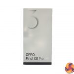
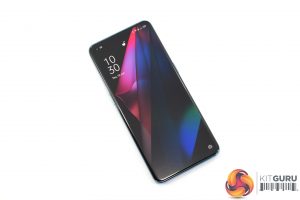
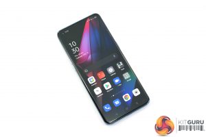
Looking first at the X3 Pro's design, it's certainly a good-looking smartphone. I've got the blue model, but it looks like only the black option is available in the UK. Still, we can see a Gorilla Glass 5 panel on the front, and yes it is slightly curved over the edges of the phone – usually I prefer a flat screen, but the curve isn't too drastic here and I can't say it bothered me during my testing.
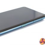
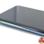
The right-hand side of the phone is home to the power/lock button, pleasingly accented with a tinge of green. On the left-hand edge there's the volume buttons, while the bottom edge is home to the USB-C port, speaker and SIM tray. Incidentally, the SIM tray supports dual Nano-SIMs, but there's no expandable storage.
The rear of the phone is quite striking. Oppo tells us this is a single glass piece, which was mapped with over 2000 points to create the panel we see here. It all flows upwards towards the prominent camera bump in the top left corner, where we get a look at the four camera modules.
Here, there's actually two primary cameras – both the wide and ultrawide cameras uses the same 50MP Sony IMX 766 sensor, the former with an f/1.8 lens while the latter is narrower at f/2.2. There's also a 13MP telephoto with f/2.4 aperture, while the final module is very unique. This is a 3MP microlens, offering up to 60x magnification. It's basically a microscope, giving an incredibly close look at your subject. This is of course something we look at later in the review.
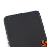
The other thing to note is the small hole-punch selfie camera, positioned in the top left-hand corner of the display. This is again very innocuous and didn't bother me during my use-case – and coming from the iPhone 12 Pro, the notch-less design was very welcome.
Display
As for the display, there is certainly a lot going on here. First and foremost, it's a 20:9 aspect ratio with a 3216×1440 resolution, so it is absolutely pin-sharp over the 6.7in panel.
It's also a very fast screen, with a 120Hz refresh rate which really does help make scrolling feel significant more fluid than on a 60Hz phone. Oppo is also using an LTPO OLED panel, meaning the refresh rate is variable and can drop as low as 5Hz, so if you're only looking at a static image or sat on your home screen, it won't be running at 120Hz the whole time, which is of course going to help battery life.
There's another key feature too – this screen is a native 10-bit panel, with Oppo calling it the ‘billion colour display'. That is certainly a USP, but how useful or beneficial that is is another matter. I like to consider myself a technical person with a keen interest in technology, but I was struggling to notice the difference between a 10-bit image and an 8-bit image when viewed on the Find X3 Pro. Watching The Witcher on Netflix, side by side with the same episode on my iPhone 12 Pro, also didn't yield a visible advantage for the 10-bit panel.
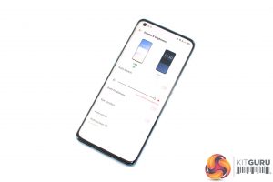
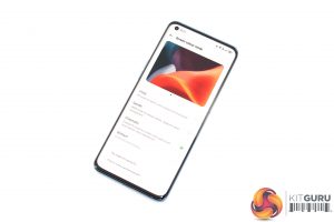
Either way though, it is still a hugely impressive screen, even if the 10-bit panel may not be as revolutionary as Oppo makes out. Colours look very rich and vibrant, with the excellent contrast you'd expect from an OLED screen. Oppo also offers a few different display modes to choose from, including ‘vivid', ‘gentle' and ‘cinematic', the latter of which was my preferred setting. In short, it really is a top-tier screen.
 KitGuru KitGuru.net – Tech News | Hardware News | Hardware Reviews | IOS | Mobile | Gaming | Graphics Cards


