Performance
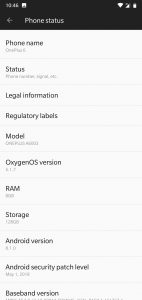
As mentioned, the OnePlus 6 sports the latest Snapdragon 845 processor, 8GB of RAM and 128GB of internal storage.
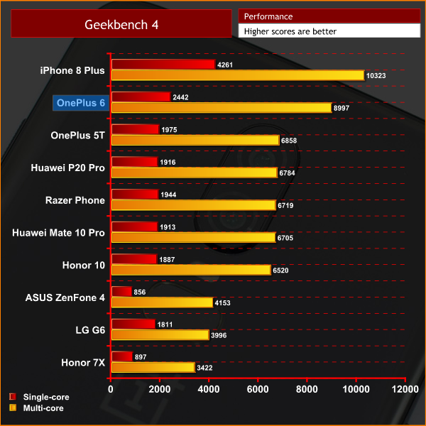
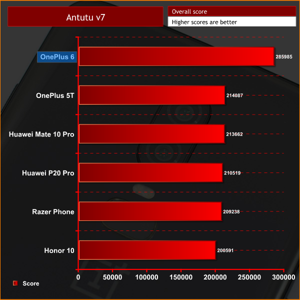
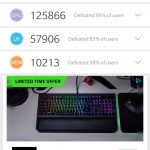
Performance according to our synthetic benchmarks is top-notch, and I can say that definitely carries over to real-world usage. In fact, I would say the OnePlus 6 is probably the nippiest phone I have used to date – apps load very quickly, switching between open apps is done flawlessly and you will also be able to use the OP6 for mobile gaming and have a top experience.
Both the fingerprint scanner and facial unlock feature are rapid, too. As mentioned, I would've preferred the fingerprint scanner to be circular in shape, but that does not stop it being very fast and reliable. Using the facial recognition is not quite as fast as the fingerprint scanner, but relative to other smartphones like the P20 Pro, it still very quick and is very reliable in low-light situations, too.
The last thing to mention here is the single downward firing speaker. This isn't something we always include, but it is worth touching on it here, simply for the fact that it the weakest area of the phone. In short, the speaker is quite tinny, with a sibilant overall sound that does not make watching videos or listening to music a good experience. OK, it is not awful – you can still hear what is being said – but clearly, the speaker is one primary area which OnePlus has skimped on to keep the price as low as it is.
Software
Moving onto software, the OnePlus 6 is running the latest version of OxygenOS – OnePlus' skin that runs on Android Oreo 8.1. This is a very lightweight skin with a focus on being fast and clean – there is no bloatware here, everything has a purpose which I love.
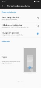
That's not to say there aren't extra features included, but they all add something useful over stock Android. My favourite of these features is the new gesture support. Instead of using the traditional nav buttons, the OnePlus 6 now supports gestures to get around – just swipe up from the middle of the phone's bottom edge to go to your home page, swipe up and hold to get to your open apps, and then swipe up from the left or right sides of the bottom edge to go back. I have found using the gestures really intuitive, and really fast as well, so it really adds to the overall nippiness of the phone. And of course you maximise what is displayed on the screen by removing the nav buttons.
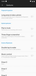
Other extra features include the ‘double tap to wake' function which I use to check the time at night – as you don't have to pick the phone up – as well as ‘three finger screenshot' where you swipe down with three fingers on the screen to take a quick screenshot.
One thing I would like to see, however, is the ability to remap the alert slider. Personally, I do use the slider to quickly switch from ‘ring' mode to ‘silent' when going to bed, but it would be great to use it to quickly open new apps or set the phone to airplane mode. I can appreciate the alert slider is quite a distinctive feature of OnePlus phones, so the company may be unwilling to compromise what they see as a unique feature, but surely giving users the extra control would only be a good thing.
On the whole, though, I really like OxygenOS. It is clean, fast and makes some good additions to the Android experience. It doesn't do things just for the sake of it – everything feels thought through – but what changes it does make feel genuinely useful, so good job OnePlus.
 KitGuru KitGuru.net – Tech News | Hardware News | Hardware Reviews | IOS | Mobile | Gaming | Graphics Cards


