Design
Note: you may need to disable your ad block software if the above gallery is not displaying properly.
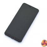
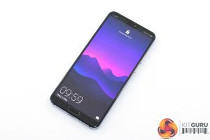
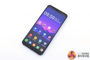
While the most interesting aspect of the Huawei P20 Pro may be those three cameras round the back, the rest of the phone's design is similarly impressive. It sports a trendy Gorilla Glass back and metal frame, but the real highlight is the new ‘Twilight' colour option that Huawei has introduced, which has a lovely gradient effect from top to bottom.
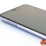
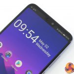
On the front of the phone, the most visible design feature here is the notch, which draws inevitable comparisons with the iPhone X. However, the P20 Pro's notch is considerably slimmer, with just a small cut-out for the earpiece speaker and the 24MP selfie camera. Incidentally, you can actually ‘disable' the notch in the system settings, which turns off the display around the notch given it a more traditional look (as seen above).
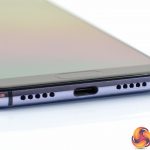
Huawei has persisted with a front-mounted fingerprint scanner, too, and this sits at the bottom of the phone, giving it a slightly chunky chin – relative to the rest of the bezels, at least. On the bottom edge of the phone, we find the USB-C charging port, as well as the speaker and microphone grilles. No 3.5mm jack.
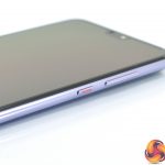
The right-edge of the phone houses the volume rocker and power button, with the power button also sporting some red colouring to make it easily identifiable. The SIM tray, which can fit 2x nano SIMs but not a microSD card, is positioned on the left-edge.
Lastly, turning to the back of the phone, we get a good look at that triple camera configuration. From top to bottom, we have the 8MP telephoto lens, a whopping 40MP RGB camera and the 20MP monochrome lens at the bottom. We will of course look at the camera and image quality later in the review.
Display
Moving onto the display, as mentioned the P20 Pro sports a 6.1in AMOLED panel. Its resolution has had a slight bump up over the Mate 10 Pro, from 2160×1080 up to 2240x1080p, but it is still not as sharp as the likes of the Galaxy S9 or Pixel 2 XL. For the pixel peepers out there, the P20 Pro boasts a pixel density of 408 PPI.
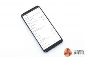
In terms of colours and vibrancy, the P20 Pro does used an AMOLED panel so it is certainly a bit punchier, with enhanced contrast, than the smaller P20 which ‘only' has an LCD panel. There is also the option in the display settings to choose between ‘vivid' and ‘standard' modes, with the latter being technically more accurate but the former giving slightly more pleasing – though admittedly more artificial – colours.
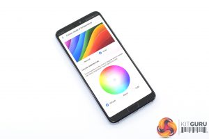
There is also a screen colour temperature adjustment wheel available, allowing users to tinker with the white balance. Out of the box, with the ‘vivid' profile enabled, I thought the white balance was perfect, though the ‘standard' profile does make whites look a bit warmer.
On the whole, I'm yet to use a phone with a bad OLED panel, and the P20 Pro is no exception. However, side by side with the new Galaxy S9 it does look comparatively flat, which is a shame considering the price. Again, it's by no means a bad panel – it's just not the best out there.
Brightness levels are good, though, with a big range that allows the phone to be very usable outdoors but also pleasantly dim when you're lying in bed at night.
 KitGuru KitGuru.net – Tech News | Hardware News | Hardware Reviews | IOS | Mobile | Gaming | Graphics Cards


