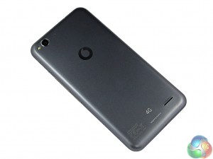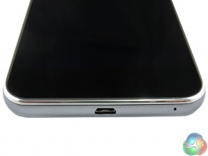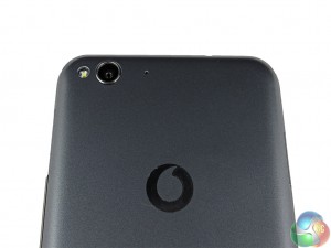
Coming to the design of the Smart ultra 6, we may as well state the obvious – the phone is rather large. The 5.5-inch display is fitted in a body which measures 154 x 77 x 8.35mm (LxWxD), giving a 70.3% screen-to-body ratio – which is fairly decent. What makes the phone's dimensions more impressive is that Vodafone have included the home buttons on the bezel itself, rather than on-screen. This means the full 5.5-inch display is usable.
Build quality of the Smart ultra 6 is probably what you would expect from a £125 phone, and I would say it is definitely the area in which Vodafone saved most money when manufacturing the device. This is because the phone is entirely plastic (grey plastic in this case), other than the glass layer on top of the LCD display. It is has a cheap-ish feel to it, and is certainly not premium. However, considering the impressive hardware specifications and that the Smart ultra 6 is just £125, sacrifices had to be made to achieve such a low price point. Unfortunately, the build quality happens to be one of them.

The actual design of the phone is fairly straightforward. The on/off button is conveniently located midway up the right-hand edge, meaning it is not a stretch to reach. The volume rocker is just above the power button. A headphone jack is on the top edge, left of centre.
It is also nice to see a microSD card tray on the left-hand edge, which slots back in to the phone when you have inserted the microSD card itself. This is a simple and tidy solution given the back cannot be removed from the Smart ultra 6.

So nothing about the design stands out and says ‘look at me!' Rather, it is a simple yet effective design which does the job and nothing more.
 KitGuru KitGuru.net – Tech News | Hardware News | Hardware Reviews | IOS | Mobile | Gaming | Graphics Cards


Non issues regarding temperatures under mid/high load ?