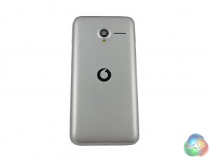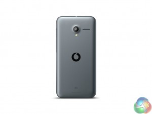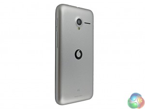
The design aspect of the ‘Smart' devices has been criticised by some journalists – principally for being plain and boring. Certainly, the Speed 6 is not going to turn any heads. However, it does offer functionality at a great price – which I think means we must adjust our expectations.
Silver (left) compared with the grey colour option
The simplicity of the Speed 6's design starts with just 2 colour options – silver or grey. Even then, they are both fairly similar – and the colour only affects the back of the device, as the front is black no matter what colour option you choose.
Of course, as it costs £50, the Speed 6 is made entirely from plastic. Accordingly, the Speed 6 is not the most satisfying smartphone to hold, and you certainly won't be turning it over and admiring the construction.
What Vodafone has done, though, is to create a design that prioritises functionality over aesthetics.
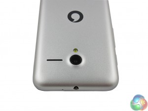
This is made evident by the placing of the power button and volume rocker on the top of the right-hand edge. This positioning means both buttons are within easy reach of your thumb at all times. The home buttons, too, are fitted on the bezel – rather than being on-screen ‘soft' buttons. This is potentially easier to understand and use for a consumer who has just bought his/her first smartphone.
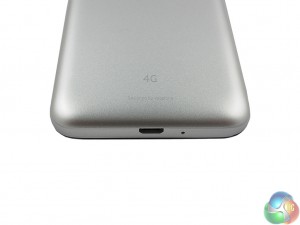
A headphone jack is located centrally at the top of the Speed 6, while at the bottom is the microUSB port. The (silver, in this case) back is bare, other than the camera and Vodafone logo.
Essentially, the design is gimmick-free. It is just meant to be usable at an affordable price, and I think that is certainly achieved.
 KitGuru KitGuru.net – Tech News | Hardware News | Hardware Reviews | IOS | Mobile | Gaming | Graphics Cards


