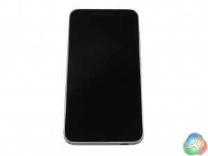
The similarities between the prime 6 and ultra 6 continue when we come to handset design. While there are some subtle differences, the overall look and feel of the two phones is essentially the same.
To start with the obvious, the prime 6 is smaller, but not hugely so. It measures 141.7 x 71.9 x 9mm (LxWxD), compared with the 154 x 77 x 8.4mm dimensions of the ultra 6. The prime 6, therefore, has a 67.6% screen-to-body ratio which is not great, but reasonable at this price point. It also weighs 155g, which I think is on the heavy side for a 5-inch display. It is actually just 4g lighter than the ultra 6 which does make me think less care has gone into the design of the prime 6.
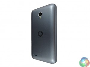
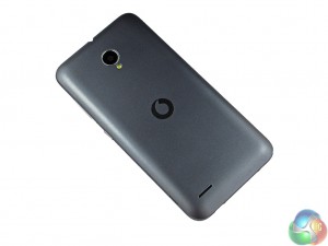
The same grey plastic construction remains from the ultra 6, meaning the phone does not feel particularly great to hold, but it is not awful. Considering the lower price of the prime 6, it is to be expected. After all, we are not going to see an aluminium and glass phone for this money. Still, the plastic serves as a reminder that the prime 6 is far from premium.
On the back of the phone, the camera has shifted in to a central position – rather than being located on the left edge as with the ultra 6. It does not make any real difference – I would imagine that placing it centrally (in the thickest part of the phone) means the lens does not have to protrude from the main body of the handset. Still, it is a difference to be noted.
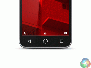
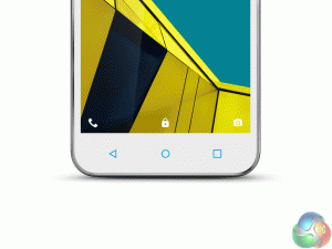
Home buttons on the prime 6 (left) compared with the ultra 6
The home buttons have been changed slightly, too. They are now much larger than on the prime 6, which I do not like. While still located separately to the screen (meaning there is the full 5-inches of screen real estate), the larger size of the buttons means they look garish and fairly tacky. I can only guess Vodafone has done this to accommodate older generations who may be picking up the prime 6 as their first smartphone. Other than that, I have not a clue why they plumped for bigger, tacky home buttons over the smaller, simple ones found on the ultra 6.
As for the microUSB charging port, that remains in the middle of the bottom edge. The headphone jack is also centrally located at the top edge of the phone. A volume rocker and our on/off switch are positioned on the right edge, both within easy reach of a thumb.
 KitGuru KitGuru.net – Tech News | Hardware News | Hardware Reviews | IOS | Mobile | Gaming | Graphics Cards


