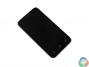
Throughout the ‘Smart' product family, Vodafone have kept phone designs simple – with no gimmicks or stand out features. The same can be said of the first 6. It has a predictable and uncomplicated design, but it is effective and gets the job done.

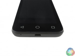
There are a few differences in the design of the first 6 compared to the prime 6 and the ultra 6, though. For one, the home buttons on the first 6 are permanently visible on the bezel. On the other two ‘Smart' devices, the home buttons are made visible by LED lights which pop up once the phone is being used.
With the First 6, the buttons are just there and do not go away. It does detract from the overall smartness of the first 6 – but in such a small way it is hardly worth quibbling about.

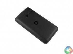
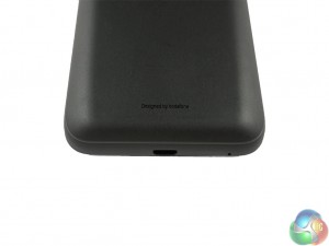
On the rear casing, a new plastic contour has been added in – despite not actually marking the outer edge of the case. By this I mean the contour is entirely for appearances sake, as it is not where the rear casing meets the chassis of the phone. Still, I think it actually looks quite sleek and helps to improve what would otherwise be a bland design.

As for product dimensions, the first 6 measures 121.6 x 64.4 x 11.8mm (LxWxD), which gives a 58.2% screen-to-body ratio. This is not great, but it is easily forgiven considering the price tag of the phone itself. The first 6 weighs in at 112g, too, which actually redeems its chunky bezels as this is impressively light (the same weight as an iPhone 5s, for comparison).
At the top of the device, centrally located, is a headphone jack, while the microUSB port can be found on the bottom edge. A power button and a volume rocker are both located on the right edge.
 KitGuru KitGuru.net – Tech News | Hardware News | Hardware Reviews | IOS | Mobile | Gaming | Graphics Cards


