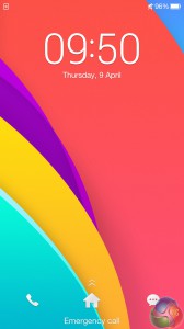

Shipping with Android KitKat 4.4.4, OPPO have included their own Android skin, which they call ColorOS. It may be colourful, but that does not mean it's good to use.
The ColorOS launcher does not look like it fits in with modern smartphone trends. For one, icons are not flat, and resemble the stock icons Apple used before updating their OS to iOS 7. The included clock widget, too, is bulky and not very stylish at all.

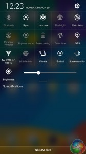
The drop-down quick settings closely resemble those used in the Acer Liquid Jade, and despite the OS being called ‘ColorOS', the icons are black and white. A cleaner could have been achieved by OPPO using white settings against a semi-transparent background, for instance.

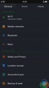
The settings menu, too, keeps the black background, but does include small, colourful icons. This is more appealing and fits with the bright theme used across the R5. The OS is nothing spectacular, with the launcher a particular let down. It feels more suited to 2008 than 2015, so definitely try other launchers if you opt for the R5.
 KitGuru KitGuru.net – Tech News | Hardware News | Hardware Reviews | IOS | Mobile | Gaming | Graphics Cards

< col Hiiiiiii Friends….'my friend's mom makes $88 every hour on the internet . She has been unemployed for eight months but last month her payment was $13904 just working on the internet for a few hours.
try this site HERE’S MORE DETAIL
????????tr5
< col Hiiiiiii Friends….'my friend's mom makes $88 every hour on the internet . She has been unemployed for eight months but last month her payment was $13904 just working on the internet for a few hours.
try this site HERE’S MORE DETAIL
????????ggsss