Design
Note: if the above images are not displaying properly, you may need to disable your ad block software as they are known to interfere with our display code.
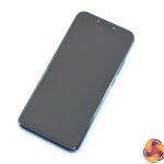
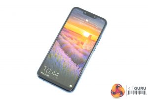
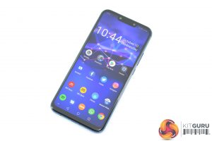
There's no denying the fact that the Mate 20 Lite looks like almost every other Android phone that has been released in 2018 – it has shrunk the bezels as much as possible, introduced a fairly wide notch and a small chin at the bottom of the device. It's certainly not ground-breaking stuff.
That being said, it feels like a premium phone which belies the fact that it only costs £379. This is thanks to the swish glass back (which is slippery, mind) and aluminium frame which measures just 7.6mm thick. I have the blue model, but it is also available in black.
For a phone with a 6.3in display, it's also relatively compact – again, thanks to the slim bezels. While Huawei's Mate 10 series phones didn't have any notches, compared to the P20 the Mate 20 Lite does have a slightly wider notch as it houses two front-facing cameras.
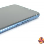
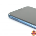
In terms of button placement, we have the power button and volume rocker on the right-hand edge of the phone, with a SIM tray on the left-hand edge which supports dual nano-SIMs or 1x SIM and 1x microSD card. It is good to see both a USB-C port and a 3.5mm headphone jack on the bottom edge, along with a single downward-firing speaker.
The back of the phone houses the two cameras and fingerprint scanner in a straight line down the middle of the phone – with the idea of symmetry being something the Mate series is known for.
Lastly, it is worth saying there is no IP certification for the Mate 20 Lite. This isn't usually a feature we see on phones around this price so I can't complain too much, but it is still something I like to see wherever possible.
Display
The 6.3in display on the Mate 20 Lite adopts the 19.5/9 aspect ratio – so it is another relatively tall and slim display. This means it has a ‘Full HD+' resolution of 2340×1080.
Across 6.3in this gives us a pixel density of 409 PPI. Essentially all the mid-range phones I have reviewed this year have a similar level of sharpness to them, and while you can tell the difference if the Mate 20 Lite is sat next to a Galaxy S9 for example, it is fine to use day to day.
It's another IPS panel, too, and it is generally pretty decent considering the price. Viewing angles are excellent, and you get relatively punchy colours. Again, sit it next to a phone with a decent OLED screen – like the OnePlus 6 – and it does start to look a little flat and lacking in contrast, but compared to other phones at a similar price, you are unlikely to get better than this.
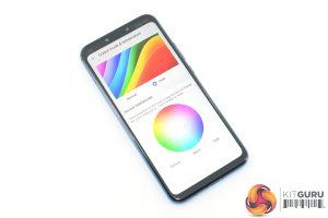
Brightness levels are pretty good too, as it is easy enough to use outdoors in bright sunlight. It doesn't get quite as dim as I would like when using the phone at night, but it's an all-round decent display. You can also adjust the colour temperature and saturation levels within the settings to tweak things to your liking.
 KitGuru KitGuru.net – Tech News | Hardware News | Hardware Reviews | IOS | Mobile | Gaming | Graphics Cards


