
The Nexus 9 was the launch device for Android's newest OS – Lollipop. We review the Nexus with Lollipop 5.0 installed.
Lollipop has given Android a bit of a face-lift, following Apple's lead when they upgraded their visuals with iOS 7. Stock icons in the default Google Now launcher are flatter, for instance, just one of several modifications that give Lollipop a modern look.

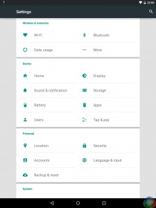
The settings menu has adopted a very clean green-on-white colour scheme, while the settings themselves are in columns – meaning the page does not go on forever with the amount of settings there are.

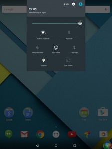
The drop-down notification panel has also been tweaked, with one swipe down showing any actual notifications, while another swipe will bring down the quick settings menu.

Google Now launcher itself now features a white background, with the colourful apps looking clean and sleek against it. It is a more beautiful Android, but remains as customisable as ever.
 KitGuru KitGuru.net – Tech News | Hardware News | Hardware Reviews | IOS | Mobile | Gaming | Graphics Cards


