Design
If you can't see the gallery above, please disable your ad blocker as they can interfere with our display code.
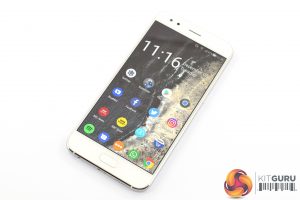
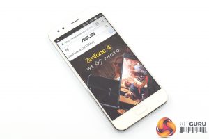
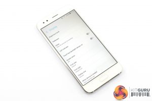
Despite the £450 price tag, the ZenFone 4 certainly has a premium look and feel to it – even if it is strongly reminiscent of the iPhone 8.
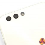
For starters, the glass back not only looks great but it is actually 2.5D Corning Gorilla Glass so it should be nice and durable. The main issue with glass backs is that they are usually fingerprint magnets, and I think that would almost certainly be the case for the black variant of the phone. I was sent the ‘Moonlight White' model, however, and I'm honestly hard-pressed to spot any marks on the back.
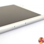
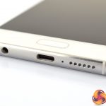
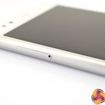
The aluminium frame also adds some rigidity while also providing some contrast to the white front and back. Speaking of the frame, on the bottom edge of the ZenFone we find the USB-C charging port, a 3.5mm headphone jack as well as the speaker. The SIM tray is on the left-hand edge, while the right-hand edge is home to the volume rocker and power button.
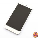
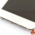
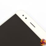
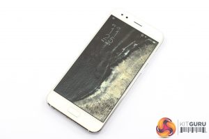
Turning back to the front, if it wasn't immediately obvious to you then it worth pointing out that the ZenFone 4 has kept the more traditional 16:9 aspect ratio instead of going 18:9, and that does mean there is a fair amount of bezel on the top and bottom. The bottom edge does house a fingerprint scanner, though, and I found it to respond quickly and accurately.
The dual-camera setup on the back is quite impressive as neither lens actually protrudes from the main body of the phone, when that is usually a given for a modern device. The primary camera is a 16MP shooter with a 83-degree field of view, while the 12MP secondary camera is much wider with a 120-degree FOV.
On the whole, the phone is well designed. It does have a slighter lower screen-to-body ratio (at 71.4%) than we are now used to seeing from the likes of the Galaxy S8 and LG G6, but it feels nice and solid in the hand and for the money I can't complain too much.
Display
Moving on to the display, the first thing to note is that the screen measures 5.5-inches, is FHD resolution and uses an IPS panel.
Accordingly, it is nice and sharp with a pixel density of 401 PPI. It isn't as razor-sharp as a phone with a 1440p display, but honestly at this screen size I think 1080p is more than enough.
Colours are also accurate and vibrant – as much as can expected of an IPS display. Blacks aren't quite as inky as you would get with an OLED panel, but I found the white-balance to be very accurate out of the box.
Screen brightness is also impressive. At 100% I had surprisingly little difficulty using the phone outdoors, which is more than can be said for other devices. ASUS claims the max brightness to be 600 nits, and while I can't verify this, held side-by-side with the Razer Phone it is a clear win for the ZenFone.
 KitGuru KitGuru.net – Tech News | Hardware News | Hardware Reviews | IOS | Mobile | Gaming | Graphics Cards



Sorry, but this review seems to miss the biggest problem with this phone : the OP5T. Oled display, thin bezels, Snapdragon 835, 6gb ram.. the list goes on. FOR THE SAME PRICE!
I think modern phone users have missed the point , charging a phone up 2 times a day isn’t fit for purpose.
I see so many people now with a power bank in one hand and a phone in the other it’s a joke 😀