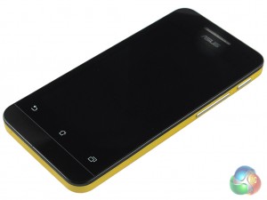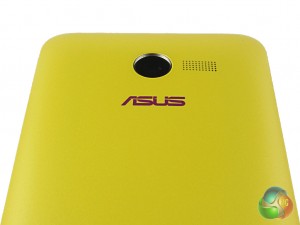
The design is where differences between the handsets begin to creep in. The first thing to note is the handset colour. Ours came with a yellow back, which, despite being unconventional – isn’t unappealing. The back is replaceable so you can swap out the yellow for black, white or red.
We think the colours are aimed to appeal for those who may like the bright design of the iPhone 5C.

Due to the inexpensive nature of the phone, some compromises have been made, too.
The phone is quite thick, coming in at 11.5mm – a common feature with cheaper phones. It’s not so bulky as to be impossible to manage, just don’t expect it to feel like you’re holding the Oppo R5.

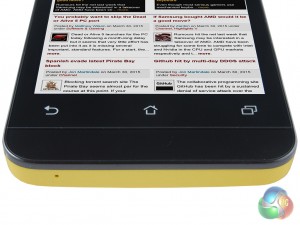
The bezel is also quite large – not hugely, just bigger than we have come to expect with modern day smartphones. This means that the ZenFone has a 59.6% screen-to-body ratio, which is among the lowest. It’s no deal breaker, just a reminder that for a budget phone you don’t get the sleek and slim design of flagships five times the price.
The ZenFone also features a headphone socket at the top of the phone, whilst a microUSB port is on the left side. The touch-sensitive home buttons – which aren’t part of the display – remain from the ZenFone 6.

 KitGuru KitGuru.net – Tech News | Hardware News | Hardware Reviews | IOS | Mobile | Gaming | Graphics Cards

I think you’re confusing bloatware with useful system apps. Most of the preinstalled apps from Asus are very useful. There is little actual bloatware.
rtye5 . true that Patricia `s report is impossible… on wednesday I bought Saab 99 Turbo since I been making $8569 thiss month and also ten/k this past month
. it’s actualy my favourite-work I’ve had . I began this three months/ago and pretty much straight away was earning more than $75… p/h . you could try here HERE’S MORE DETAIL
“which ASUS have made removable, so you could carry a second one around – you would need it” trust me you cannot actually remove the battery.