Design
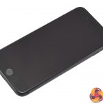
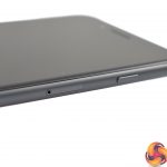
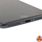
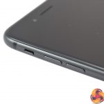
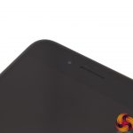
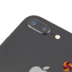
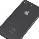
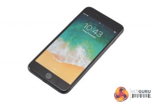
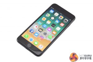
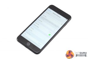
Jumping straight into the design of the new iPhone 8 Plus, here we present an gallery of the phone. All photography is handled in-house by KitGuru.
On the whole, there is not much to mention here – the iPhone 8 Plus is very similar to its predecessor and I'd argue the overall design is similar to every other iPhone going back to the 4.
The big talking point is of course the new glass back – it certainly looks good and has the added benefit of allowing for wireless charging, too, though you will need to buy a charging plate separately as one does not come included.
Other than that, the 8 Plus retains the physical home button, the side-mounted volume and power buttons as well as the aluminium frame we have come to expect from Apple. Unfortunately, I do think this design is now looking quite tired and aged – the thick bezels look very out-of-place in 2017, and compared to the iPhone X, the 8 Plus looks decidedly unappealing. 5 years ago, sure – we'd be thinking this is a lovely design. Now, in today's market, it is certainly disappointing and feels stagnant.
That's not to say it isn't well-built or that it isn't lovely and thin – it is – the screen-to-body ratio is just quite poor. To demonstrate this, take my LG G6. The LG has a 5.7-in display but the whole phone measures just 148.9mm long. The iPhone? 5.5-in display in a chassis that is 158.4mm long.
Essentially, if you want to be at the forefront of the current phone trend – that of reducing phone bezels to an absolute minimum – then the iPhone 8 Plus will certainly not do the business. The iPhone X, however, looks great.
Display
Moving to the phone's display, the same overall trend can be observed here – it's very nice, but nothing has really changed. What I mean by this, is Apple has persisted with an IPS LCD panel – just like every other iPhone of recent memory. It is capable and looks lovely, but the industry is rapidly moving over to OLED panels for their obvious benefits – unbeatable contrast ratios and battery life savings being the main two.
Furthermore, the iPhone 8 Plus retains its 1080p resolution as well – across the 5.5in panel this gives 401 PPI. Every other flagship I can think of uses 1440p panels now, and this does make Apple seem like they are lagging behind.
There is one new feature to talk about, though, and that is True Tone. Essentially, this is a new automatic feature which adjusts the colour of the phone's display in accordance to the ambient light levels and white-balance of your surroundings. The end result is to keep colours looking consistent across different environments – for a more detailed explanation, check out this link.
You can see two photos of the phone's display above – the one on the left has True Tone disabled, the one on the right has True Tone enabled and you can see that the display is noticeably warmer with the feature turned on. In my experience, this is typical of True Tone – warmer colours which can be easier on the eyes. I did not use it, simply because I would rather have a cooler screen than a warmer one, but the option is there.
 KitGuru KitGuru.net – Tech News | Hardware News | Hardware Reviews | IOS | Mobile | Gaming | Graphics Cards


iPhone X is the cool looking one, this is basically the iPhone 6 with hardware upgrades – same shape etc. Its a 3 year old design, looked quite dated in 2014 IMO
Solid ass review
Hm, so 800 for old reliable or 1200 for flagship. Yeah, this is why I don’t buy high end phones. Insanely expensive considering what you get.
I could not hope for a better compliment for any of my reviews. Thank you kind sir
Hilarious pricing, you seriously have to be a total dumbass to pay these prices nowadays.