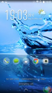
The OS included with the Jade family has always been my biggest issue with other Jade models, and it is unfortunately the case again here. Acer simply have not learnt from previous mistakes, and insist on giving consumers the same, old and tired version of Android KitKat.
Do not get me wrong, it is nothing against KitKat itself. As a mobile OS, I like it a lot. It is just that Acer insist on including their own system skin and drop-down menus which look more suited to a smartphone from 2010 than 2015.

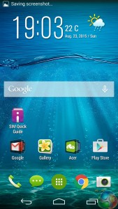
For instance, we have the home screen. A cheesy default background starts things badly, and the weather widget is a huge ‘no-no' for me as it is rather tacky. Icons need to become flatter, too, to give a modern look. There are also a few home pages filled with cheap looking widgets, including a mobile data tracker and an ‘Acer suggests' widget which gives Acer-recommended apps.

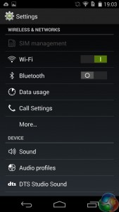
As we continue to the settings menu, the drab theme continues. There is no colour here at all, which makes everything look terribly dull. We have a monochrome list which is exceptionally boring to use, and could do with being separated into different tabs for different setting categories. This would save users scrolling down and down and down until they find the desired setting.

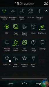
The drop-down quick settings menu follows a similar pattern. Everything is black and white until you activate a setting – e.g. turning on WiFi – when the icon turns an unappealing shade of green. Everything looks very blocky and dated, too, which is an unfortunate theme running throughout the OS.
So on the whole, we have a terrible mobile OS. If Acer want to include KitKat, fine. But they should have had the sense to leave it alone, as stock KitKat 4.4 is a strong OS in its own right. What Acer have done is to include a mobile operating system from (what feels like) 2010 on a smartphone for 2015 – which simply does not work. What makes Lollipop and iOS 8 good, modern operating systems are their flat icons and bursts of colour. Acer's OS does neither and as such it is a massive turn-off for me.
 KitGuru KitGuru.net – Tech News | Hardware News | Hardware Reviews | IOS | Mobile | Gaming | Graphics Cards


