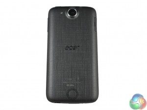
While the general shape and chassis of the Jade Z is identical to the Jade S and the original Jade before it, the design of the rear casing has been altered somewhat.
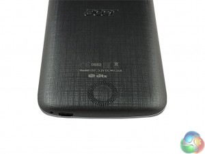
The Jade S introduced a dark purple criss-cross pattern across the back of the phone, which I found helped grip the device. The Jade Z is dark grey in colour and while it does not have the same criss-cross pattern, the back is lined with ribbed markings which you can see in the above pictures. It does not feel especially nice in the hand, despite looking fairly smart. I found it felt somewhat like sandpaper, and it did not even aid the grip of the phone. Still, on a purely aesthetic level, it is a nice touch.
The Jade Z does remain incredibly light, weighing just 110g. For a 5-inch phone this is mightily impressive, and as I have mentioned previously – the Jade Z is light almost to a fault, as it feels rather insubstantial. Still, the weight of the device makes the Jade Z very pocket-friendly, and reflects well on Acer.
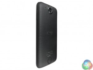
As for product dimensions, the phone measures in at 143.5 x 69.8 x 7.9 mm (LxWxD) – which is also impressive. With the 5-inch display, this gives a screen-to-body ratio of 68.8%, which is not bad but not market leading. Overall, though, the weight and size of the Jade Z make it a good option for those not looking for a ‘phablet'. One-handed use is very possible with the Jade Z.
One other mainstay of the Jade design has been a protruding camera, and this is unfortunately the case again with the Jade Z. It is only an extra 2 or 3 millimetres, but it does not look especially great and does mean the Jade Z does not lie perfectly flat on its back.
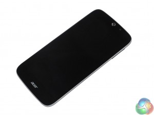
As for power buttons and the like, the right edge houses a volume rocker while the on/off button is on the top edge iPhone 5-style. A microUSB charging port is located right-of-centre (when the phone is face up) at the bottom edge.
 KitGuru KitGuru.net – Tech News | Hardware News | Hardware Reviews | IOS | Mobile | Gaming | Graphics Cards


