When it came to the design of the original Liquid Jade, we praised the slim body, but the glossy finish to the phone felt very cheap and looked terrible. It seems the Liquid Jade S may be about to right some wrongs.
That being said, both designs are by-and-large the same. That said, there are a few differences when it comes to the Liquid Jade S which are definite improvements over the original phone's build.
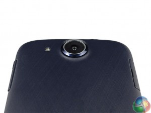
For one, the glossy back is gone, and in its place is something completely different entirely. There is now a matte finish to the plastic, and though it may look black under dim lighting, it is actually deep purple in colour. The same criss-cross design from the phone's box is also used. While certainly unusual, it is a vast improvement. It does not feel cheap; the plastic sits nicely in your palm, and the matte finish means fingerprints are not on display.

Everything is slightly more subtle with the Liquid Jade S, with makes it a more appealing handset to look at. Another area where this is the case is the camera lens. Though it still protrudes by 2 or so millimeters, the silver ring around the lens is gone, which was very tacky. The new camera edge fits the rest of the deep purple colour scheme.
The Liquid Jade S is also still incredibly light – weighing just 116g. This is 6g heavier than the original, but the difference is negligible. When combined, the incredible lightness, slim bezel and 7.8mm thickness make this a very pocket-friendly phone.

The on/off switch remains at the top edge, on the right, while there is a volume rocker on the right edge. The SIM tray is still removable without the need of a pin – which is a handy feature – while the microUSB port sits on the bottom edge.
 KitGuru KitGuru.net – Tech News | Hardware News | Hardware Reviews | IOS | Mobile | Gaming | Graphics Cards


Your first choice kitguru Find Here