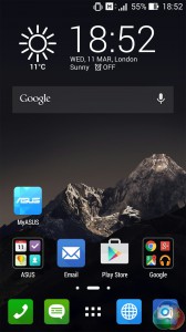
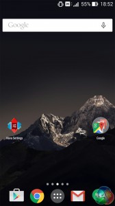
ASUS Launcher (left) next to Nova Launcher.
Coming to software, the ZenFone 6 launched with Android Jellybean, 4.3. It is now upgradable to KitKat 4.4.2, and ASUS have confirmed that Android 5 – Lollipop – will be coming to the entire ZenFone line-up in April 2015.
As it is, we tested the device with KitKat.
ASUS have designed their own launcher for the ZenFone – ASUS Launcher – whilst the general UI has been aptly named ZenUI. ASUS Launcher replaces the stock ‘Google Now' launcher found on Nexus and Motorola devices. Overall we found the launcher clunky and cluttered, but ZenUI is so simple and beautiful – we loved it.
Starting with ASUS Launcher, the first thing we noticed are the busy home pages. This mainly comes from the very large icon sizes – which can't be made smaller – and over-complicated widgets, which squeeze in too much text. App icons are attractive, however, with a ‘flat' look now common to mobile operating systems, plus a pleasing shadow effect.
It's just not enough to make us inclined to use ASUS Launcher – we prefer something more user friendly and customisable like Nova Launcher – at least this way we can shrink down the gargantuan icons.
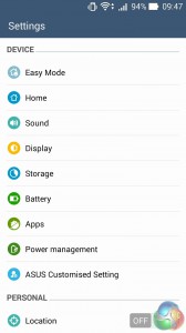
ZenUI is an entirely different matter. Its main appeal is its beauty and simplicity. The settings menu is wonderfully clean, where small, round and colourful icons contrast against the white background.
The notification panel is also well designed – swiping on the left-hand side brings down the system notifications, whilst swiping from the right gives you access to the quick settings feature. This quick settings drop-down is aesthetically pleasing with more minimalist and round icons, though it defaults to showing every quick setting there is – resulting in a cluttered appearance. You can customise this, however, to make sure only the settings you want appear, rather than them all.
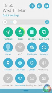
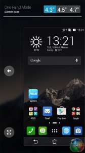
Quick settings (left) next to a cool one-handed mode.
On the whole, the ZenFone's software seems a mixed bag. ZenUI is stunning and its simplicity makes it effortlessly practical. ASUS Launcher, though, is too busy and lacks the sleekness of ZenUI. Pair the ZenFone with a different launcher like Nova and it would be a great partnership.
 KitGuru KitGuru.net – Tech News | Hardware News | Hardware Reviews | IOS | Mobile | Gaming | Graphics Cards
Considering its price, this seems like a strong contender for the nexus spot. Given that the new Nexus 6 retails for around £500.
✉✉⚓✉⚓✉⚓get over 13kM0NTH@ag21:
Going Here you
Can Find Out,
►►► https://WorkOnlineApp.com/get2/position98…
I have this phone… after 3 months of usage 2 stuck pixels appeared. Had to send it back for screen replacement now I have to wait a month or more :c
you dont have this phone the phone just came out this mount
zenfone 6 is from 2014 brah