Design
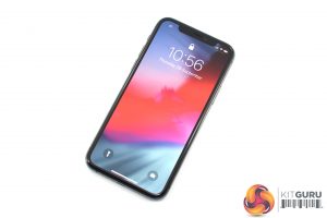
If you were expecting the iPhone 11 Pro to sport a radical new design compared to both the iPhone X or XS, then you will be disappointed. There have been a couple of minor tweaks, but by and large the design is the same here.
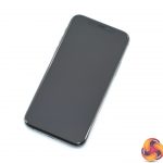
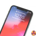
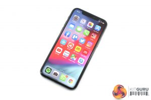
That means we still have that high screen-to-body ratio, with a uniform bezel extending around the bottom and sides of the phone. The wide notch at the top, housing the necessary sensors for Face ID, is again present.
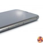
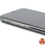
The right-hand side of the phone is home to the power/lock/Siri button, while the left-hand edge houses the ringer slider and volume buttons. One interesting point to note is that the iPhone 11 Pro is slightly thicker than its predecessor at 8.1mm. As far as I can tell, this actually makes it the thickest iPhone since the iPhone 4S launched back in 2011.
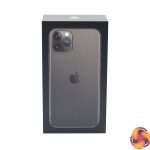
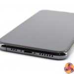
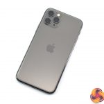
The lighting port remains on the bottom edge, flanked by speaker and microphone grilles, and flipping the phone over we get a look at the slightly updated rear glass panel. I have the Space Grey colour, but we can see the bulk of the rear panel is a matte, frosted glass. This makes a change from the glossy finish of the X and XS handsets.
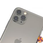
And at the top of the phone, how could we ignore the new triple-camera setup! The three lenses are housed in a glossy square module, and positioned in a triangular shape. A lot of people have expressed their dislike of this part of the design, but I have to say I am pretty indifferent to the aesthetic – in my opinion, you're not really looking at the back of the phone when you're using it in the hand, so I don't really mind. The one thing I did notice was the cameras protruding from the body meant the phone doesn't lie completely flat, but again it's a relatively minor point.
So overall, not a whole lot to say about the design of the new iPhone. I think it still holds up well in 2019, the notch could be slimmer – it was quite chunky back in 2017, and that's only furthered here – but the more you use the phone, the less you notice it, so overall no complaints from me.
Display
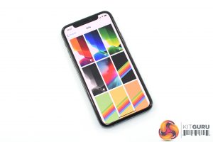
Moving onto the display now, it's again a case of minor updates here. The size and resolution is identical to the iPhone X/XS – 5.8in, 2436 x 1125, giving a pixel density of 458 PPI. For me, it is plenty sharp and the size is also great in my hands as I could comfortably use it one-handed. If you want something bigger, the 6.5in iPhone 11 Pro Max offers that extra screen real estate.
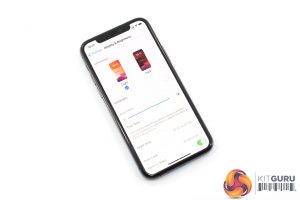
One new feature of the iPhone 11 Pro is its 1200 nits peak brightness rating, when viewing HDR content. When you're just out and about, Apple claims a peak brightness of 800 nits, which is up from 625 nits from the iPhone XS.
Now I haven't owned the XS, but I was able to compare the 11 Pro with a friend's XS side-by-side, and I think the overall differences are small but just about noticeable. When watching HDR content on Netflix, I think the 11 Pro did look just a touch brighter and more vibrant, but even in that scenario things are still far from night and day.
That's no bad thing, however, as the colours are still nice and punchy while contrast is similarly excellent. As far as phone displays go, I do think this is up there with the best.
One last thing to mention is that the screen is still 60Hz. I really would have liked to see Apple bump this up to 90 or 120Hz, as they have done with the iPad Pro since 2017, while other Android phones like the OnePlus 7 Pro and ASUS ROG Phone 2 have also adopted high refresh-rate displays. These displays are still far from widespread, but I think it would have really helped the phone, especially considering its ‘Pro' branding.
 KitGuru KitGuru.net – Tech News | Hardware News | Hardware Reviews | IOS | Mobile | Gaming | Graphics Cards
