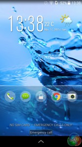
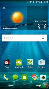
Shipping with Android 4.4.2 – KitKat – Acer also include their own launcher, called Acer Home, rather than use the stock Google Now launcher.
In truth it is not too different from Google's own launcher. The default layout did feel somewhat clunky due to the weather widget which takes up almost half the home screen, but it doesn't take much to remove it in favour of a simpler widget.
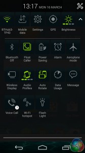
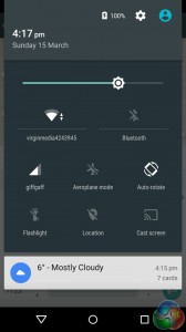
The Liquid Jade quick settings (left) compared with stock Android Lollipop quick settings.
The rest of the home pages are taken up with the Google apps which manufacturers using Android have to feature, as well as other widgets that might seem handy but really just get in the way – like a music player. There's nothing wrong with the launcher per-say, there's just no wow factor. It's functional, but there's nothing to excite you about going back to your home page.
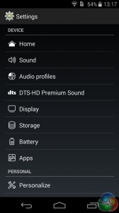
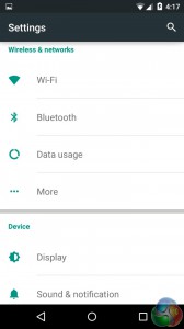
The Liquid Jade settings menu (left) compared with stock Android Lollipop settings.
The same goes for the system's UI. It's unpleasantly dark and seems to be desperately crying out for some colour – something we felt the ZenFone 6 did very well. The quick settings found by swiping down on the notification panel are too busy for our liking, and also lack the simplicity and beauty of the stock Android quick settings.
It's hard to explain what we don't like about the software overall, as it is fully functional and has no major issues. There's just no stand-out features, nothing that says ‘look at me!' It all works, but lacks beauty and elegance, meaning the UI is straightforward but often clunky and dull.
 KitGuru KitGuru.net – Tech News | Hardware News | Hardware Reviews | IOS | Mobile | Gaming | Graphics Cards


