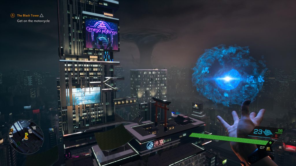
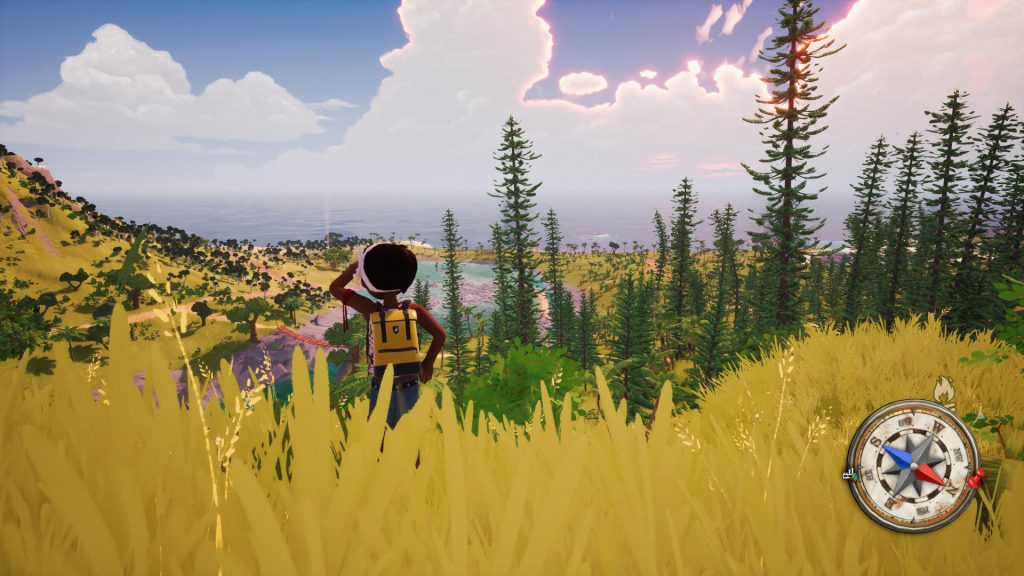
As video games have increased in size and scope, so too has the need for ways to understand your current positioning in relation to the rest of the crafted world around you. By far the most common way to do so nowadays is to slap a circular/square mini map in one of the four corners of your screen. Mini maps are objectively useful (as in they often help you get to your objective) and are as much of a staple as other quality-of-life features including fast travel and objective markers. That being said, I HATE mini-maps, I despise them, I abhor them – and yet they remain a ubiquitous part of most games.
Decades of using mini-maps as a core function of gaming has in my opinion held the games industry far back from its maximum potential. This is even more so the case when looking at the few games which have managed to eschew themselves of this unnecessary necessity. Solutions to the archaic mini-map have existed for decades but for ‘reasons’ a majority of titles opt to return to the old-yet-comfortable blanket that is the mini-map – a blanket which is inadvertently suffocating the industry to death.
In looking at these rare examples of games which have managed to shed themselves of the burdensome mini-map, hopefully a greater understanding can be had; ultimately allowing for a better sense of how the industry can evolve to the benefit of the games, as well as its players.
First thing’s first though, what exactly is my beef with mini maps? Well, to answer that question, I must ask another question: What genre of games use mini-maps the most? Aside from competitive multiplayer titles such as Call of Duty and Destiny (which I believe are justified in their applications of mini maps as they serve entirely different functions), the main types of games to utilise such UI elements are open world games. And what are open world games known best for? Their sense of exploration.
Now, I understand why a developer would want to add a mini map to their open world game – after all they are some of the physically largest games developed in terms of square footage. Getting lost in an open world can be a truly magical experience, but equally it can be pure frustration. This all, in my opinion, depends entirely on the way the game world itself was designed.
Unfortunately, due to the ubiquity of mini maps as a gameplay function, most open world games are created with the knowledge that players will have a mini map available to them at all times. What this can lead to is a situation in which the explorable world itself makes little sense without the guidance of a mini-map, creating an overreliance on it and in many ways taking away from the open world experience.
Some games have tried to slap a plaster on the issue by offering ‘immersive modes’ in which mini maps (alongside most UI elements) are disabled, theoretically unburdening you from the necessity of glancing away from the world itself to stare at some icons in the corner of the screen. Unfortunately, as mentioned above, a majority of these worlds are designed from the get-go with the mini map as a default – ultimately leading to a situation in which toggling on the immersive mode simply leads to a greater sense of frustration, as the world itself fails to guide you in a natural way to its many points of interest.
While already enough of a reason to reconsider the function and necessity of mini maps, my primary issue with mini maps is just how overwhelmingly distracting they are.
Now, this might be more of a personal issue of mine, but for as long as I can remember, I have found mini maps in open world games to be incredibly distracting, so much so that it can completely destroy my sense of immersion and discovery.
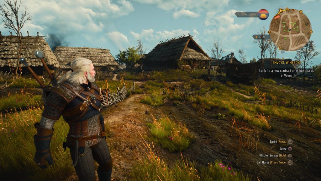
A great example of just how ruinous mini maps are can be seen in my experience with The Witcher 3: Wild Hunt. I chose The Witcher as not only is it one of the most revered games possibly ever, but was also one of my personal favourites of the past generation. I put a solid 200 hours into the base game and both expansions – and had a whale of a time throughout. That said, a good chunk of those hours were spent with my eyes glued to the top right of the screen following the dotted line to whatever my objective was.
While it certainly could be more of a personal problem, the abundance of mostly-useless icons popping in and out of the mini map’s boundaries as it rotates to align with wherever you are facing made it incredibly difficult to ignore, and ultimately overly-distracting. Could I have turned off the mini map? Yes, but again, going back to what I said earlier, this would have only caused added frustration as I try to navigate the various regions of White Orchard; Novigrad, Toussant and the Skellige Isles.
So, how can this long-standing issue be fixed? Well, over the years we have seen a decent number of different methods implemented. Perhaps the simplest can be seen with the likes of the Horizon series, in which the UI elements are made invisible unless you hold your thumb on the PlayStation controller’s touchpad – offering a temporary glimpse at the mini map / health bar etc. While undoubtedly an improvement, the functionality of the mini itself is unaltered, meaning when it is visible it suffers from the same issues mentioned above.
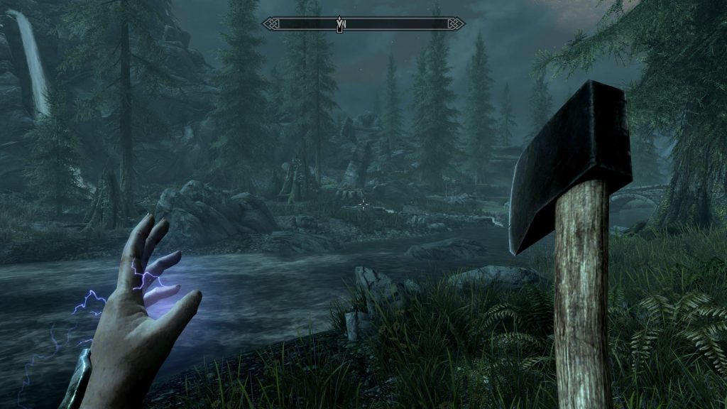
One solution which was perhaps popularised by Bethesda Game studios’ Skyrim is the use of a horizontal compass. Typically positioned in the top-middle of the screen, it offers most of the functions of the regular mini map while taking less space and being far less distracting – owing to its shape and position on the screen. Furthermore, with it being in essence a horizontal line, the compass helps you to know which direction you need to go, but not necessarily how far away it is; helping to bring back a bit of that sense of discovery.
With all that said, there is one solution which in my opinion is not only the best way to aid with navigating an open world, but should be the ONLY way – that being contextually sound and appropriate in-world navigational explanations. But what exactly do I mean by this?
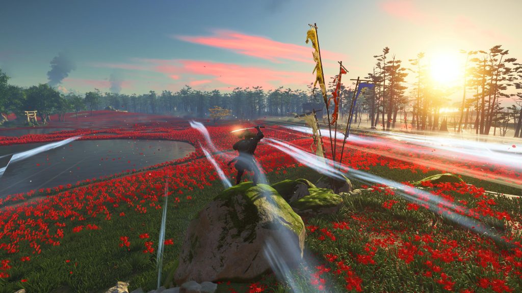
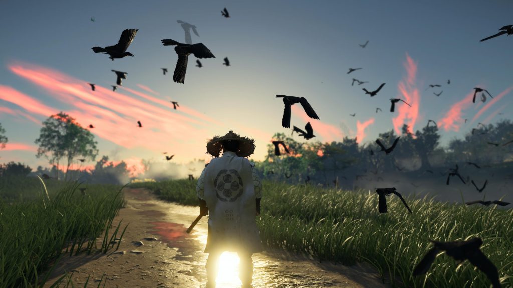
Ghost of Tsushima’s Guiding Wind mechanic is in my opinion by far the best way to allow a player to freely explore an open world while still giving them the necessary tools to ensure they do not get lost.
For the uninitiated, the Guiding Wind is an ingenious mechanic developed by Sucker Punch Productions in which swiping forward on the touchpad creates a draft of wind which moves in the general direction of your targeted objective. While simple enough in its implementation, I have perhaps never felt more at ease exploring an open world, purely just due the fact that I was able to keep 100% of my focus on the world in front of me; distraction-free.
This not only aided with the sense of personal discovery – as my attention could be drawn to in-world events and places around me while navigating to my objective – but also my immersion. Unlike most games, whose mini maps exist externally of the game world and lore itself, Ghost of Tsushima’s Guiding Wind is given narrative context: the wind represents the spirit of your father ‘guiding’ you to the right path.
In this way, Ghost of Tsushima’s Guiding Wind is in fact the antithesis of the modern mini map – it not only does not take away from your immersion, but actually enhances it while remaining just as functionally useful.
Similarly, many of the discoverable points of interest across the world are hinted at in equally immersive and lore friendly ways. If you come across a fox, follow it and it’ll lead you to an Inari shrine. Golden Yellow birds flying in the sky will take you to undiscovered locations, and music cues will let you know when you are approaching certain POIs.
The team at Sucker Punch Productions seemingly did everything they could in order to ensure that as much of your time spent playing as possible was within the world itself – and for a game as visually gorgeous as Ghost of Tsushima, this can only be a good thing.
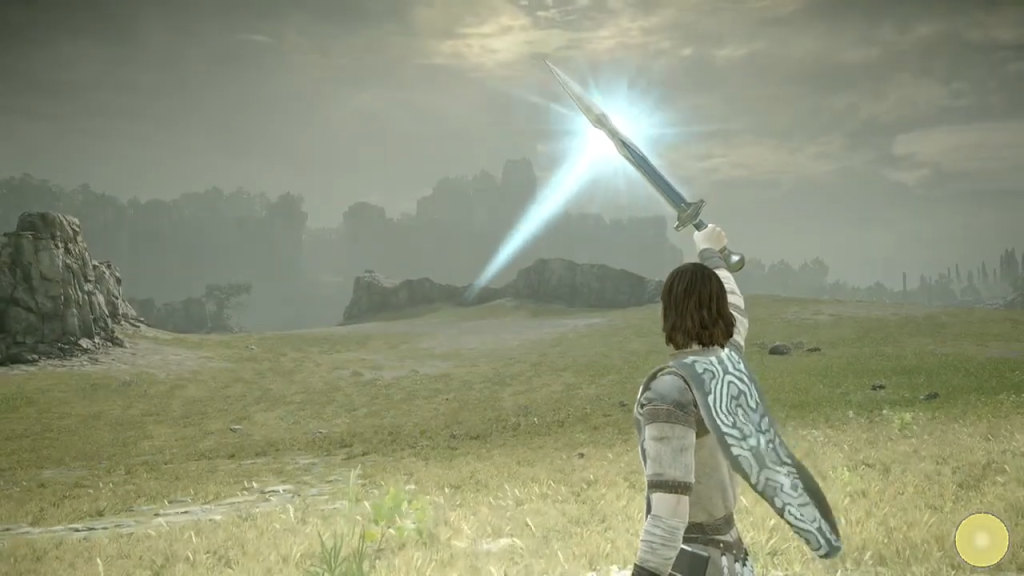
I can think of just one other game which took a similar approach to world exploration – that being the 2005 PS2 classic Shadow of the Colossus from Team ICO. For those unaware, your player character (Wander) possesses the ‘Ancient Sword’ which is able to absorb light and redirect in the direction of an active colossi.
Just like with Ghost of Tsushima, this eschews the need for a mini map while simultaneously immersing you in the world further. Without this singular mechanic, I truly believe that Shadow of the Colossus would not be nearly as well revered as it is today. Whether subconsciously or not, the replacement of a mini map with some form of in-game navigational mechanic allows for continuous and unbroken levels of immersion – something which most open world games in today’s age fail to manage.
Going back to a mini map after playing games like Ghost of Tsushima and Shadow of the Colossus feels like a strong regression in game design. Imagine what kind of worlds we would be exploring had all future titles post-SOTC opted not to use mini maps? The likes of Elden Ring and The Legend of Zelda Breath of the Wild might not be quite as revolutionary due to the fact that the industry as a whole would have evolved their game design far beyond the current standard.
Shadow of the Colossus was unfortunately unable to open the eyes of developers to this new way of building and designing immersive worlds. Hopefully Ghost of Tsushima is able to pick up where Team ICO left off.
Discuss on our Facebook page HERE.
KitGuru says: What do you think of mini maps? What open world game do you think did exploration best? How can the Guiding Wind mechanic be evolved further? Let us know your thoughts down below.
 KitGuru KitGuru.net – Tech News | Hardware News | Hardware Reviews | IOS | Mobile | Gaming | Graphics Cards


