Since its initial launch, Google Stadia has found minimal success, with the game streaming service being overshadowed by the likes of Xbox Game Pass and GeForce Now. Despite this, Google continues to make Stadia better by the day, having now released a complete revamp of the service’s user interface.
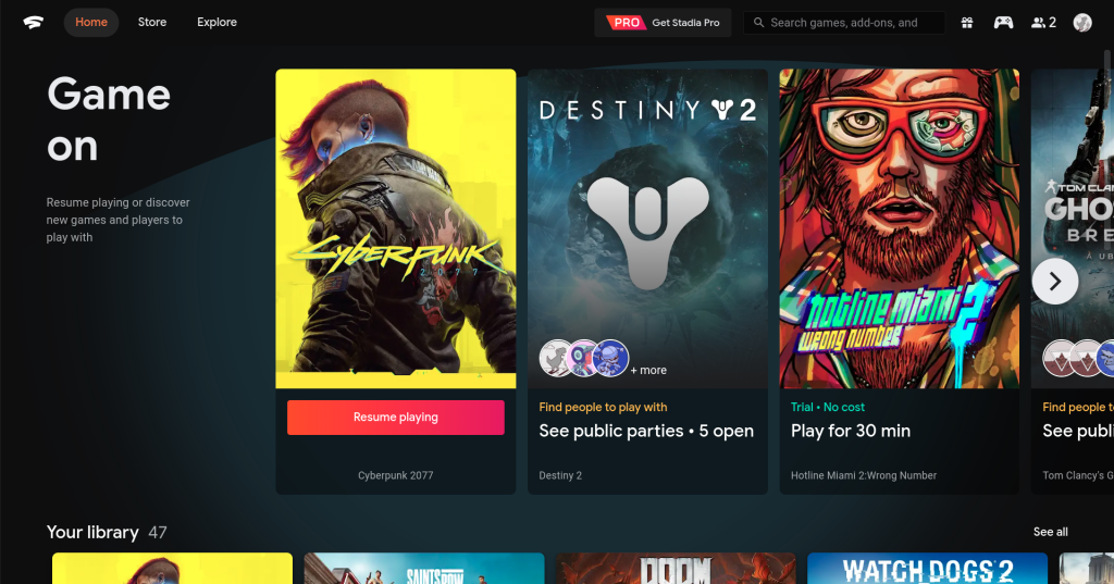
Rolling out region-by-region (as confirmed by Stadia Community Manager ‘DanFromGoogle’), Stadia’s new UI, brings with it a whole host of major changes, including the home tab which has been completely overhauled, offering a much more console-like experience, with games taking centre stage through a horizontally scrolling list of titles.
Other changes include the ability to jump into one of Stadia’s many game trials without the need to access the store itself, making for a much more seamless experience. Additionally, you will be better able to track your friends and see what they are playing, and can jump straight into different parties within games without needing to open the game itself first – not too dissimilar to the PS5’s cards feature.
These are but a few of the many changes brought with this latest update. Google themselves have yet to release a full changelog for the update, and so it will be interesting to see all the small tweaks and changes made when Google does officially detail this update.
KitGuru says: What do you think of the new UI? Do you like it? Have you received the update? Let us know down below.
 KitGuru KitGuru.net – Tech News | Hardware News | Hardware Reviews | IOS | Mobile | Gaming | Graphics Cards


