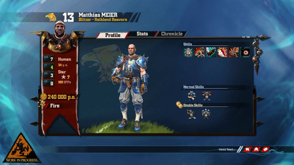
Cyanide's previous iteration of the Games Workshop tabletop fantasy (in the Tolkein sense of the word) football title did pretty well considering it's not one of GW's biggest properties, selling over a million copies in its llifetime – though the many different editions may have helped there. Still, a sequel is in the works that looks to expand on the original game and one of the big improvements is said to be in terms of the user interface, which thanks to “Grib,” we now have our first look at.
This image quickly tells us what a massive overhaul the GUI has had for this sequel. The menu system itself is much cleaner looking and is obviously designed with higher resolutions in mind. Also skills have had icons added instead of being a list of text. That won't make much difference to hardened Bloodbowl veterans, but might make them easier to learn for newer players.
Also of note is the “chronicle,” tab which perhaps will tall the tale of whichever player is selected and their history of the game.
It's worth noting too, that Grib mentions “transcribing the cards.” Now cards weren't present in the original Bloodbowl game, they did however show up in the Death Bowl expansion (in I think, third edition? BB experts help me out there), so it seems we might get to use those in the new PC version, though whether they'll be cards or some sort of inducement, we'll have to wait and see.
KitGuru Says: Myself and Matt are currently engaged in a Bloodbowl League of our own. Neither of us is doing particularly great, but Matt did lose his Minotaur to a deathblow by a Bloodletter in the first game. Bad luck mate.
 KitGuru KitGuru.net – Tech News | Hardware News | Hardware Reviews | IOS | Mobile | Gaming | Graphics Cards


