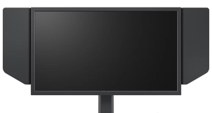
Kitguru has reviewed many monitors over the last year including those from industry leaders Dell and iiyama. In June we reviewed the Asus MS236H, a stylish monitor which appealed on a design level, but left us wanting in other areas. It delivered much unfulfilled potential.
Today we are looking at the follow up model, the ML248, which is a part of the Designo ML series. These models are heavily focused on eye catching design ideas and an almost ‘Apple' ethic of keeping the appearance sleek and minimalistic.
The Asus ML248 is an 24 inch LED driven design based around a TFT active matrix panel. Native resolution is 1080p (1920×1080) with a response time of 2ms. With a brightness level of 250 cd/m2 and a dynamic contrast ratio of 10000000:1 it certainly has a decent list of specifications. In a similar fashion to the previous model we tested there is no DVI port, only VGA and HDMI.
 KitGuru KitGuru.net – Tech News | Hardware News | Hardware Reviews | IOS | Mobile | Gaming | Graphics Cards


That sure is a sexy looking screen. wont be replacing my Dell 2405 mind you, but yeah very apple like by design, im sure thats intentional.
Very attractive looking screen, i like the black/white deal they got going on. Not sure id agree it was an apple design, but I get the point. connectivity is too limited for me, but I wouldnt be looking at this screen myself. decent enough looking model though, better than the last one.
Power consumption is excellent. Really love the LED technology for that aspect. I like the looks of this. my next move will be the 27 inch dell screen with 2560 res though. its 800 quid, so ill be a while saving for that one.
Attractively designed, but im not sold on that base design, seems rather flimsy looking. My friend has the last range and the base is hideous. they looked to have just slapped on another part to it !
Not sure technically its breaking any mould, but I like the idea of the pSU externally designed to keep it thin. Power consumption is great.
Still want to move up to a 30 inch, but cant afford it, and probably wont be able to for another year at least.
Sexiest screen ive seen for a long time, the rear is very well designed. the base is weird looking, seems like it would crumple in on itself??
Would like to see it in the flesh, 2ms is good though.
What is the point of removing DVI and keeping VGA? is this to suit people with old systems or something? I was going to jump all over this for having no DVI, but they gave a cable away for it so its ok I guess. still weird decision from ASUS. DVI is still the way it should be. displayport should also be an option.
Anybody have any idea if the ASUS ML238H is performing the same as this one. I was thinking of buying it in a few months since it’s in my price range but haven’t been able to find some professional reviews of it. I really like the nice look of it and judging by this review if they are the same and only the size is different i really want to buy one.
the specs look the same koRn. same LED backlight, 250 cd/m2, 10,000,000:1 dynamic. 1080p resolution. id say you would be getting close if not identical performance.
http://www.newegg.com/Product/Product.aspx?Item=N82E16824236095 user reviews here seem good Korn. looks like a hell of a deal actually.
Korn just found a classic deal there. i think id rather get the 238, big savings, for an inch smaller. Cant see anything else thats different.
Thank you for this review! You have convinced me to buy it …